Overwatch delivers diversity alongside racist stereotypes, still does better than rest of AAA gaming [LONG]

Overwatch, the hit new shooter/MOBA released by Blizzard has been taking the internet by storm lately. (That is, until the internet collectively lost its damn mind over Pokemon Go this past week[1].) As of mid-June, they had already accumulated more than 10 million active players, no mean feat considering that it was released less than two months ago.

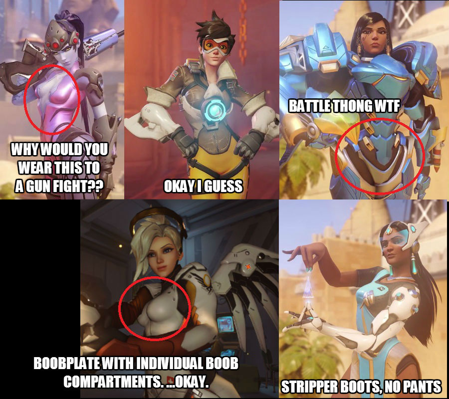
Since the beginning of its development, one of the major talking points that has been emphasized in press pieces is that Blizzard was trying to design with an eye to diversity. Like the piece on Kotaku proclaiming that Blizzard wanted to “do women better”, which showed Widowmaker displaying a whole lot of ass cleavage:

Meanwhile over on Polygon, there was a piece with the headline: “Blizzard wants its diverse fans to feel ‘equally represented’ by Overwatch’s heroes“. Which, by the way, only featured quotes from a press conference given by Blizzard, and which completely failed to mention any of Blizzard’s previous problems with representation in their games to date. (*cough* Hearthstone *cough* Worldofwarcraft *cough*)

I’ve written about Overwatch before. (In fact, people talking trash about my Overwatch posts are still a reliable source of occasional traffic spikes from Reddit, which is a bit surprising two years later.) And the game’s recent release, along with the fact that it seems diversity is still being used as a talking point to promote the game – as evidenced by this piece published just 3 days in advance of the release, made me think that it would probably be worthwhile taking a second look at Overwatch to see how it’s shaped up.

Overwatch Characters and Gender

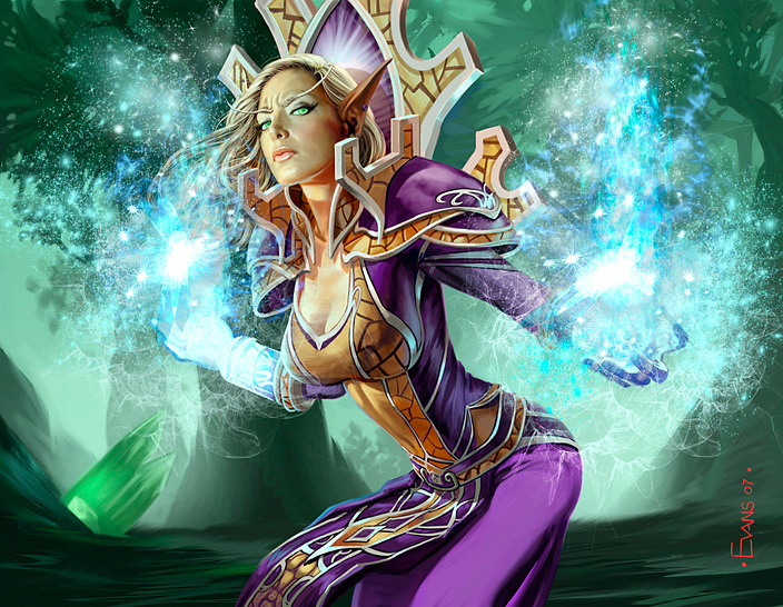
The last time I wrote about Overwatch, 6 out of the (then) 14 characters that had been announced were female, however, 1 character – Bastion – was genderless. If you don’t count Bastion, that made for a roster that was 46% female – not too shabby. At the game’s release, it featured 8 female characters out of 21 characters that have a gender – which was only 40%. However, as of yesterday, a new female character was announced – Ana – which brings the ratio up to 9 out of 21 gendered characters, or 42%.

icons-gender

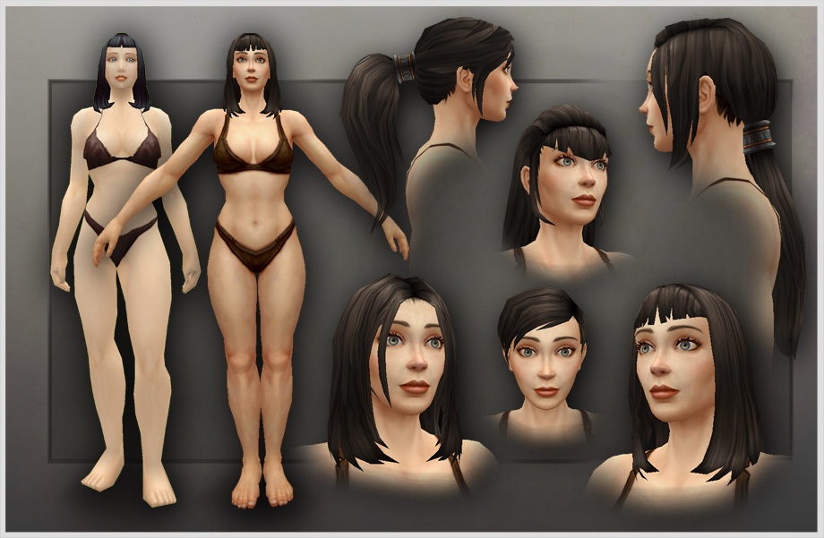
So, you know. It’s not fifty-fifty, which is disappointing from a game that says it wanted to “do women better”. How hard would it have been to make one of the weirdo characters, like Winston or Zenyatta, female? And sure, 42% is still a damn site better than almost every game I’ve ever bothered to review numbers for on this blog. But I tend to think that to “do women better”, you should at the very least reflect their levels of representation in the actual world. And we won’t even talk about how there are ugly or weird looking male characters, but all of the female characters except for one are in their mid-20s and have flawless skin – except for Ana. And even then, the only concession to her age is white hair and maaayyybbbbe a hint of an eye wrinkle.

It’s worth noting that all of that completely ignores the issue of queer and nonbinary gender identities. Since the canon doesn’t say otherwise, it has to be assumed that all 21 of the gendered heroes are cisgender, which is – again – disappointing from a game that seems to be trying to sell itself, at least in part, on the diversity of its character’s designs and backgrounds.

But overall, those turned out to be minor irritants compared to the embarrassing levels of racism (with a sprinkling of ableism) in the hero backstories and alternate character designs. Hooray!

Character Backstories

Lucio

So out of a lineup of 22 characters, you have exactly 1 black person – Lucio. And YES I get that there are other characters who are visible minorities – Symmetra, Pharah, Hanzo, etc. But what about McCree and Soldier 76, who are both from the United States? Or Tracer, who is from the UK? Or Widowmaker, who is from France? Or Mercy, who is from Switzerland? All of these are countries with diverse populations! Black people live in all of these countries! Coding all of the Western first world nations as white is problematic as hell. (And no, Widowmaker does not count as a PoC because she’s blue.)

So with all of that in mind, it is doubly problematic that Lucio – the only black guy – is a black guy from the slums. And sure, he’s from the favelas in Rio de Janeiro. And sure he was “fighting the man”. But the core concept was “black DJ from the slums who stole things”. And when your go-to backstory for the only black guy is “poor thief”, that is super fucking problematic. The stereotype of black people as thieves and criminals is the reason why real actual black people get profiled by police and followed in shops and stores. And the fact that the video games industry is more than 87% white makes all of this even more problematic.

So. You know. What the actual fuck, Blizzard?

Reaper

Similarly, Gabriel Reyes AKA Reaper is the only Latino in the game (you know, despite the fact that it actually would have made more sense to make McCree Latino instead of making him white). And what’s his backstory? Well, according to the Overwatch wiki:

Reaper admits to being a high-functioning psychopath, having a passion for murder and vengeance and is willing to kill even without a solid motivation. —Overwatch Wiki

And this is shitty for pretty much exactly the same reasons that making Lucio a black thief from the slums is shitty. When news coverage of Latin@s is 1% of total coverage, despite the fact that they make up 13% of the US population? And 66% of that coverage is about Latinos as criminals? Making THE ONLY LATINO in your game an actual fucking psychopathic murderer is shitty and racist.

Symmetra

Symmetra’s backstory and concept doesn’t read as racist to me, although I’ll admit to not being conversant enough with those particular stereotypes to be able to spot something that’s not completely obvious. However, where her backstory does fall down is a WHOLE LOT OF FUCKING ABLEISM. And sure, it’s obvious that it’s at least well-meaning ableism? But there is a lot of hinky mental health and neurotypical stereotyping going on. Again, according to the Overwatch Wiki:

Symmetra may be on the autism spectrum as implied in A Better World[1]. In it, she says it used to “bother her” when people would ask where she fit on the spectrum; further, she appears to have what could be described as obsessive-compulsive disorder, namely her preoccupation with “perfection”, such as when she can’t resist fixing a crooked picture or how she notices the perfection of a child’s face. Traits common to OCD are also associated with autism.[2] —Overwatch Wiki

For fuck’s sake.

First, if you want to have a character who is on the autism spectrum, EITHER DO IT OR DON’T. Don’t say well she miiiiiiight be, but then maaaaaybe not. Because what the fuck is wrong with having a heroic character who is autistic? Nothing. Absolutely nothing.

Second, fixing crooked frames or noticing a perfect face isn’t OCD – unless you spend your entire day checking and re-checking and re-checking every picture frame to make sure it’s straight, or obsessively scanning people’s faces looking for flaws, to the detriment of actually getting anything done. OCD is an anxiety spectrum disorder, emphasis on the disorder. If it doesn’t interfere with your daily life and ability to function, then it’s not OCD. Being particular about how things are placed or wanting things to be just so? That’s not fucking OCD, and it’s really shitty trivializing OCD that way.

Character Designs: Racist Tropes and Culture as Costume

Mercy

So I’ve written before about how it’s really problematic making the character who is coded as “angel” blonde. But you know what’s even shittier? Making your angel character blonde, then having an alternate skin named “Devil” and giving that skin black hair.

Not following why that’s problematic? Well, allow me to quote myself:

Here’s another one I wish I didn’t see as often as I did. If you’re writing a race that has inborn magic powers, immortality, supernatural sexiness, preternatural senses, or is otherwise superior to normal boring humans, DON’T have the defining trait of that race be a real world racial trait.

Wait. No. I’m going to be more explicit.

DON’T MAKE THEM BLONDE. Because that is some creepy white supremacy shit right there – ESPECIALLY when combined with the Evil Darkies [aka: the trope of making evil races have dark skin] mentioned above.

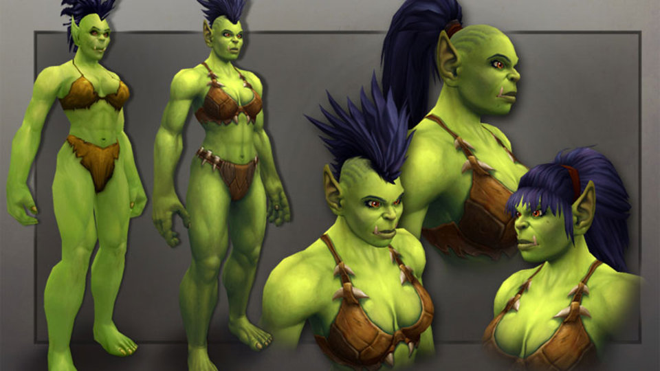
That’s not to say you can’t have superhumans! … you can keep 100% of your magical superhumans and still have them not suck. Case in point, World of Warcraft. The good elves are purple and the bad elves are blonde. (Granted, there’s still an awwwwwful lot of fail of just about all types in WoW. But this is, at least, one small thing that they did manage to get right.)

When you tie the idea of “good” to traits that are White and “evil” to traits that are Not-White, THAT IS RACIST.

Mercy-angel-devil

The irony is that Mercy’s other alternate skins depict her as a Valkyrie, which honestly I like about a million times better than either her default skin or her “Devil” skin. Boobplate aside, they did a great job of translating the character concept into a design appropriate to the character’s cultural background.

Zenyatta, Roadhog, and Pharah

Zenyatta is a bit of a tricky case in that he is a robot (who is gendered as male) monk who is never explicitly called out as being a Buddhist monk. But his backstory says he wanders the Himalayas, and the Saffron robes as well as descriptions of Zenyatta’s approach to philosophy make it pretty clear that he is supposed to be a Tibetan Buddhist (robot) monk. And, you know what, cool. There could be some cool elements about robots deciding to investigate humanity and ending up identifying as a particular gender and culture.

What is definitely uncool is tying Zenyatta strongly (if implicitly) to one culture, and then using other cultural costumes as alternate looks:

Zenyatta

Look. This is a theme that I’m going to come back to for the next few designs, but I would think that after the stink that gets raised on the internet and social media every October, people would start getting the hint that using cultural attire or cultural dress for the sake of looking “cool” is not okay. Culture is not costume.

This gets even more problematic when Native and Aboriginal cultures are the ones being used as costume, because there is a global history of white people oppressing Native and Aboriginal peoples and then appropriating their culture.

Take Roadhog, whose has two alternate skins that show him in Maori dress:

Roadhog-Maori

And. Man. Here’s where I admit that things get real fuzzy and hard to tease out. Because while it’s not commented on officially, it’s possible that Mako is of Maori descent:

“It is highly likely that Roadhog is of New Zealand Maori heritage due to his real name (Mako) and alternate skin titled “Toa” which is the Maori word for “Warrior”.” – Overwatch Wiki

And honestly, I keep going back and forth on whether this is problematic or not. Roadhog’s pale skin reads more “white” than “Maori” to me. But then, the long struggle of Metis and non-status Native Canadians to be recognized as “legitimately Native”, makes me feel like that might not be a valid criticism. Except, Roadhog is said to come from the Outback of Australia – and the Aborigine people of Australia and the Maori of New Zealand are two different peoples – or at least as far as I’m aware.

So. I think for me the tipping point, the deciding factor of “is this okay?” is the fact that there are so many other examples of stereotyped depictions and appropriative costumes. This isn’t a singular misstep in a game that otherwise did its homework and tried to be respectful. Because if it was, you wouldn’t have something like Pharah and her alternate skins:

Farah

Pharah is explicitly, canonically Egyptian. And yet two of her alternate skins are explicitly North American Native – titled “Raindancer” and “Thunderbird”. And that is just such an obvious, straight-forward case of “what do we do for a cool alternate look for Pharah?” “I dunno, make her Native?” that I just can’t even.

Symmetra

And here’s the last example, the reason why I’m really not inclined to give the Blizzard development team a lot of slack on the question of “did they mean to be offensive” or not. Symmetra, who comes from India, has two alternate skins – which cost a lot of credits to unlock – that depict her as the Hindu goddess Kali:

Symmetra-goddess

It’s hard to overstate how gallingly tasteless and appalling this is. Hinduism isn’t like the worship of the ancient Egyptian gods. While using Ra as a skin for an implicitly Tibetan character is tasteless, it’s nowhere near on the same level of awful, because you’re talking about a dead religion. There are somewhere around 1 billion Hindu people on the planet, which makes this roughly equivalent to having a male character who can “level up” into Jesus. And obviously, game developers would never consider making Actual Fucking Jesus an unlockable skin, because that would be disrespectful. But because Hindus are mostly brown people, that makes having Actual Fucking Kali – who is a god that real actual people actually worship right now – somehow okay? No. Just. NO.

Conclusion: Overwatch has problems, but it’s still better than the rest of AAA gaming

As horrible as all this stuff is, Blizzard at least gets the absolute minimum of points for trying. Which is something that the rest of the AAA game industry is emphatically not doing, as evidenced by yet another year of Scowly McWhiteGuy being mostly the only thing on offer at E3.

SO. MANY. WHITE GUYS.

So. You know. Reluctant kudos for trying? But “slightly less racist than the rest of the AAA game industry” isn’t exactly a ringing endorsement that Blizzard should be proud of.

[1] I am unspeakably bitter that Pokemon Go has yet to be released in Canada

Blizzard tries to “do women better”, completely misses the point

(I didn’t mean to go nearly two weeks without a paid post! However, the PhotoShopping for the last part of this post took significantly longer than I thought it would, and I lost a lot of evenings this past week to rehearsals for the play I’m in. Alas!)

Quite a while ago, this drifted across my tumblr dash (courtesy of Bikini Armor Battle Damage – which is a great tumblr that I love), and I facepalmed:

arg

It’s almost like… Blizzard has a complete lack of awareness of how and why their games were failing at women in the first place. No, wait, scratch that. It’s exactly like that. Because that’s what it is. That’s exactly what it is.

Curious to see what the other characters were like, because I hate myself and like being angry, I went digging for a character roster and found this:

lineup-wide.1z8E7
CLICK FOR LARGER VIEW

Now, looking at it, I’ll admit that this does do better than WoW and Hearthstone, in that 5 out of 12 characters are gendered as female. However, given that Blizzard’s modus operandi is to clearly delineate female gendered characters with BOOBS, I think it’s a safe assumption that the four characters without immediately discernable gender (Robot Monk (front), Giant-ass Robot, Heavy-Armor Gorilla, and Mech-with-the-Bird[1]) are going to be gendered as male.

Especially when you consider that Blizzard character designers operate under the assumption that characters are either interesting or female, but never both.

Granted, 5 out of 12 characters is 41% female representation – which is much better than Hearthstone’s batting average of around 22%. But still! You’d think that if a game company is going to trumpet that they’re trying to “do women characters better” (and really, I hope that was Kotaku’s phrasing and not Blizzard’s, because that’s a really unfortunate choice of phrasing), this is the low hanging fruit.

It’s not hard! TWELVE IS AN EVEN NUMBER. Half of twelve is six. If you want to NOT FAIL AT WOMEN CHARACTERS, you should maybe, I dunno, HAVE HALF OF THEM BE WOMEN. (At least.)[3]

Even then – even then – I might have been happy with this as a sign of progress if the character designs weren’t so uniform, or if they didn’t fall into all the same design pitfalls as their other games. Looking at the above image, the male-gendered characters cover every body type imaginable, while the women are all slim (some impossibly so – I call bullshit on the angel’s ribcage), all present as femme, and all fit standard definitions of pretty. And then of course, things get uglier when you start looking at the character designs more closely:

overwatch women
TOP, L TO R: Widowmaker, Tracer, Pharah BOTTOM: Mercy, Symmetra

Widowmaker (top left) is bullshit, for obvious reasons. Why the fuck would you wear that to a gunfight? Her boobs are about to pop out any second, not to mention the massive ass cleavage in the first screenshot. (Seriously, her suit looks like it must be lodged in her colon. WTF.) Tracer (top middle) is… yeah, okay, I guess she’s okay. I mean she’s skinny as fuck, but maybe that’s part of the tomboy vibe? We’ll come back to her.

Symmetra (bottom left) is yet another instance of Blizzard’s obsession with designing characters that wear dresses with thigh slits that go above the hips, no pants, and stripper boots. But at least she fares better than Mercy (the angel, bottom left), who not only doesn’t get pants but also has some of the most ridiculous fucking boob armor I’ve ever seen. You want to “do women characters”, Blizzard? How about you don’t put them in fucking boobplate?

Lastly, there’s Pharah. Initially I was pleased with her design, even if I was miffed that she didn’t get to be big and bulky like the male heavies. I actually like the contrast of her femme presentation (especially the eye makeup) with the heavy armor. And then I spotted THE BATTLE THONG.

Seriously, look at the male armored characters. None of them have ridiculous armor cod-pieces, so what gives? It’s like someone tried to give her a strong design without sexualizing her, until some studio head came in and said “yeah, yeah, that’s great, can we put her in a thong?”[2].

And all of this is just the obvious issues with the individual character designs! None of which are helped by shit like this piece of promo art here:

Overwatch-67
(I didn’t realize until I started writing this post that there’s a 5th male character squeezed in between the cowboy and the angel, which properly makes the ratio 2 out of 7.)

Oh hey, look. Two out of seven characters are women, and neither of them are in any way focal. So that’s good. Nice to know that Blizzard is still committed to women not being important to anything ever at all.

And remember Tracer? The one “yeah, I guess she’s pretty okay” character? Well don’t worry, because Blizzard made sure to sexualize her as well. So far there is only one Overwatch statue available and it’s this one:overwatch-tracer

Ridiculous boobs and butt pose? Check. Ass cleavage (seriously, who is it on the design team that is so obsessed with ass cleavage? That’s just weird), check. Distorted anatomy? Check. Phew! For a second there I almost thought Blizzard was going to manage to not screw that one up!

Oh, but I can’t forget to mention that the game’s role assignments are also horrendously stereotypical:

roles

That’s right. Two out of three healers are female, two out of four high-DPS/rogue-equivalent characters are female, one out of three defensive characters are female (the least-clothed female character to boot), and there are zero female tanks. Because women are just too dainty and fragile and shit. Or something. REASONS.

So basically, if Blizzard really was trying to make an effort to “do women characters” better, then they failed miserably. Yeah, okay, they didn’t fail quite as hard as they do in all of their other games! But touting this as some kind of achievement is like bragging that you only slap women a little sometimes instead of full on punching them in the face. You don’t get feminist cookies for not failing slightly less than you used to.

How could this be better? Re-examining design choices

If I’d followed my usual posting format, I could have rambled on for another 1,000 words easily about individual characters and problematic design decisions as well as problematic meta-patterns. But instead, I decided to do something a little different – I decided that I would PhotoShop the full-cast poster to actually show how easy it would be to have a character lineup that isn’t fucking terrible.

It turns out that this was a bit more a time investment, PhotoShop-wise, than I anticipated, mostly because the figures all overlap. However! The fact remains that more than half of the changes I made were purely cosmetic! Check this out:

wip2
CLICK FOR LARGER VIEW

So first, the easiest fix – the gender imbalance. Make one of the characters without obvious gender voiced by a female voice actor, and suddenly the problem is solved. I went with the gorilla, since that’s a character design that recalls other male archetypical characters (like Beast and others). Also, that way there would be a female tank, so win.

Next, looking at the design of the humanoid female characters overall, I was pretty pleased by the overall racial balance. Two brown ladies, a purple lady, and two white ladies? Rock on! Except. Mercy is an angel character with blonde hair. Which. NO. We’ve been over this. Always having angels be blond is some creepy white supremacy bullshit, okay? And sure, I could have shifted her skin tone as a fix, but part of the point of this exercise was to show HOW LITTLE WORK it is to fix this shit. (While I was at it, I also de-boob-plated Mercy’s armor and widened her waist enough to give her a fucking ribcage.)

Symmetra and Pharah were also changes that required almost no effort. I widened Symmetra’s thighs a bit because her torso is not totally skinny like Tracer’s. If she’s carrying more weight on top, then her legs should be more than just pipe cleaners, okay? I also gave her some fucking pants, because FUCKITY FUCK SHE SHOULD BE WEARING PANTS. As for Pharah, I resized her by about 50% to make her the same height as Really Huge Robot Guy, because at least one of the women needed to be a giant, with that degree of character size variance. (I also half-assedly got rid of the battle thong, although it was totally lazy and I can do better.) As for Widowmaker? I let her keep her bullshit costume, but I made her fat so that she’s fat, badass, and sexy. Now at least she reads as someone doing sexy for herself and not because she’s some game dev’s fetish/fantasy.

Lastly, looking at the humanoid male characters (Cowboy Guy, Dwarf Guy, Big Bruiser Guy, and Samurai Guy[4]), there was a serious imbalance in representation with only samurai guy arguably counting as Asian and the others all definitely coded as white. So since Mexican, Native, and Black cowboys are largely erased in anything that portrays cowboys ever, boom. Cowboy Guy is now Latin@.

I also wanted to make one of the other male characters Black, since I wasn’t positive that Symmetra read as Black. I wasn’t thrilled about my choices, but opted to make Dwarf Guy black by shifting the skin tone and desaturating his blond beard into a grey beard, operating on the “grandparents as PCs make anything better” principle[5]. Sure he’s an Angry Black Guy now, but in my head he’s a badass grandfather who’s just angry because people are trying to fuck with his teammates, and when they have downtime he tells awesome stories and makes pie or whatever.

And there you have it! I won’t make any claims that this lineup is 100% free of problems, but if one person can fix most of the problems with a game’s lineup with 4 hours and PhotoShop, then we’re not talking about things that would require a vast investment of resources to correct! Unfortunately, while Blizzard cares enough to give lip-service to the idea of “doing women better”, it’s obvious that they don’t care enough to actually put their money where their mouth is. So I’m not going to hold my breath for any actual substantive changes in their design directives any time soon.

[1] I could take time to look up their names, but honestly I don’t really give a shit. I’m not likely to ever play this game.

[2] I hate everything. Seriously, everything.

[3] CAN YOU TELL HOW ANNOYED I AM?

[4] Again, I literally do not give enough shits about ever playing this game to Google their names. Just more proof that I’m either NOT A REAL GAMER or OUT TO DESTROY GAMING, I guess. Take your pick.

[5] Grandmothers always trump grandfathers. ALWAYS.

Blizzard doesn’t care if I think Hearthstone is fun

I’ve been playing Hearthstone lately and rather enjoying it. It gives me a quick casual gaming fix, I don’t really feel compelled to play even when I don’t have time, and given that I’ve been getting into playing more Magic lately, I just really like the gameplay. So like many, many other people, when the new single-player Naxxramas expansion was released yesterday, I downloaded it and took it for a spin.

I only had an hour to play, so I didn’t manage to get through all the new content, but I enjoyed what I did unlock, for the most part. It was challenging and fun getting a look at some new and very different deck types. But I had a moment early on in my playthrough of the new stuff that made me stop, sigh, shake my head, and say “yup, this game wasn’t meant for me all right”. It happened right after I defeated Normal Boss #1 and started a match with Normal Boss #2, Grand Widow Faerlina:

Oh, Blizzard. Why you gotta be like that?

Now, sphere boobs aside, her anatomy isn’t actually that bad. The only (hah) problem is her… armor? …dress?

Honestly, I don’t know what the hell to call it. Given the level of detail we can see on her boobs, collarbone, abs, and belly button, she’s wearing vacuum-sealed spandex at best and at worst is wearing body paint and nipple pasties. (Since I don’t, thankfully, see any visibly erect nipples. Thank god for small mercies, I guess.)

Even more ridiculous is the fact that she is wearing gigantic shoulder plates and bulky gauntlets and… no other substantive armor – I’m not counting the decorative armor plates on her skirt. But while we’re on the subject of her skirt, what the hell is up with the visible panty lines?? Or her knees, which somehow got the skirt vacuum-sealed around them sufficient to define the anatomy of her kneecaps, while the rest of the skirt is simultaneously flowing free?

Honestly, this is the most extreme case of “draw naked, add clothes with extreme reluctance” that I’ve seen in a piece of WoW art in quite a while. And since we’re talking about Blizzard, that’s saying… a lot. And it really, really bugged me.

I play Hearthstone because it’s fun and it’s free, and I like free. When I play, I just want to kill some time and have fun with a game that gives me strategic gameplay in bite-sized increments. What I don’t want is to continually have my fun disrupted with visual reminders of how very few fucks Blizzard gives about female gamers like me. (Hint: the answer is none.) Some days, getting past the bullshit and having fun is harder than other days.

Of course, it took me a while to get into playing Hearthstone, despite the positive reviews of friends and the free. (Did I mention that I love free?) Mainly because all of their promotional material that I saw used this artwork:

The interesting/pretty binary strikes again. Notice how it’s two dudes playing and the only women (three in a scene of 13) are just watching admiringly. And sure, there are men who are just spectators as well, but an awful lot of the banner ads I saw were cropped down to just Muscles McDudeOrc and Cheerleader McLadyOrc, which distills the awful in this picture down to its purest form. (Also, is Cheerleader McLadyOrc even wearing clothes? I’m not convinced that she is.)

Sadly, even with a meager 3 out of 13 figures being women, the above promo image is actually more inclusive of women than the actual hero selection (albeit by a mere 1%), where only 2 out of 9 hero characters are women:

Now because it’s not immediately apparent how awful the art is from these partially cropped icons, here are the images that these icons are taken from:

Great. So we have Valeera in her ridiculous cleavage swimsuit with spikey armored shoulders and boots, and Jaina, who… who… I don’t even know what is going on. It looks like she’s casting a boob-enlargement spell, only it’s backfired and they’re about to explode out of her top. Literally.

The really weird part is how Jaina has a (admittedly incredibly useful) spell called Mirror Image that summons supposed duplicate images of her. Only her duplicate images look like this:

So her mirror images are actually not nearly as crappy as her hero avatar, which is… strange. We’ve still got broken spin, chest TARDIS, and vacuum-sealed sphere boobs. But, you know, at least her boobs aren’t about to explode? Yay?

The funny thing is that in the initial mental outline I had for this post, I was going to make a point about “ugh why couldn’t they just use not-shitty art of Jaina”? Until I realized… there isn’t any better art. Mirror Image Jaina is about as good as it gets, for awful values of good. Seriously, these two were the “best” images of Jaina I could find (not counting WoW screen caps):

So that sucks. Especially given that my best deck right now is a mage deck, which means I spend an awful lot of time staring at Jaina’s stupid exploding boob cleavage.

Unfortunately, things don’t get much better when you look at the actual cards themselves. (I really should do a numbers breakdown of all of the current Hearthstone cards by gender and other factors, but that’s a bit more involved than I have time for at the moment.) There aren’t very many women featured in the card art, but most of the women who do appear are pretty fucking terrible. Here are some of my least favorite examples, most of which are taken from common or basic cards. (The Scarlet Inquisitor and Ice Block are rare)

/sigh.

I don’t think I need to go into why these fail, do I? Although I will note that I was surprised at how much worse the art for Whirlwind is at full size, as compared to the tiny cropped version on the cards you see on the screen. Also, wrt the art for the Argent Squire, can fantasy artists please stop using porn as a facial reference? I’m getting really fucking tired of random o-face on my female fantasy warriors. kthx.

I was going to end this post with art of female characters that I actually liked

But then I couldn’t find more than one piece. I mean, I guess the Novice Engineer and Reckless Rocketeer are okay. But they both still have stupid cleavage. Really the only piece of art of any woman that I’ve seen and said “cool” and didn’t feel compelled to eyeroll about was the Violet Teacher:

So at least one artist at Blizzard doesn’t have their head entirely up their ass when it comes to drawing women. I guess.

New WoW models: Men get character, women get vapid beauty [MANY IMAGES]

A brief note before I start:

It’s been almost two weeks since my last post, and I apologize for not even putting up a freebie. However, despite my best efforts to stay the hell out of a recent blowup in the TRPG blogosphere, a certain person decided that he wanted to try to incite his followers to harass me. Again[1].

Thankfully, his followers don’t seem to dislike me as much as he wants them to. Either that or he just doesn’t have as many true followers as some other folks, because the referral traffic I got from his blog was pretty minimal. Still, it made for a very stressful and emotional week since I had to deal at first with the anxiety of seeing that he’d made a post about me, then with getting dragged into the whole shitstorm surrounding his post, not to mention the fun of having people calling me a liar on a social network that I frequent. (Mostly people that I’d already blocked, at least. Yay?)

Anyway, tl;dr. I spent much of the last week and a half working on not-blog things because it was easier to manage the fallout of a bunch of internet bullshit not of my making if I kept myself busy with other projects. So thanks for your forbearance, and thanks also to those of you who sent me messages of support.


On to business…

I’d been hearing people in my gaming circles talk about new character models in WoW for the last little while. And it’s about damn time, considering that I quit WoW more than four years ago and the graphics looked dated even then. But it wasn’t until last week that I happened to come across a detailed look at one of the new models – the new human male:

All in all, it looks like a decent improvement. And actual facial animations? Looks pretty cool. Curious, I went looking for the human female.

…and promptly wished I hadn’t:

Ugh. This is why we can’t have nice things.

Leaving aside the fact that all of the human preview models I’ve seen have been white (because white is the “default” setting for humans, of course), let’s just talk about the bullshit sexism here. Notice how the male human gets to have actual facial expressions that convey emotions? While the female character renders all have the same vapid expression but with different hairstyles. Because men get to DO THINGS and EXPRESS THEMSELVES but women get to BE PRETTY.

/headdesk.

But of course, it’s not like I should be surprised. It was this kind of bullshit that led me to quit WoW in the first place. The interesting/pretty binary pervades pretty much every facet of WoW. From my Ret Paladin’s inability to find high level pants that were actually fucking pants, to necro-tits, to the absolutely abysmal representation of women in the lore.

Oh yes, the lore. Where the few women who show up are completely useless (Jaina) or important only for their connection to a man (Tyrande). And all of the big important events that shape the world are set into motion by the BIG MANLY MANZ.

Because I hate myself, I decided to go looking for more of the new models. I’m not going to go through every race, because that would be tedious. I’ll just cover the examples that stuck out the most to me.

MOAR STUPID

When I located a preview of the female orc model, I was disappointed to see that her renders also suffer from vapid-sameface-with-different-hairstyles, although not to quite the same extent:

Now I’ll at least give Blizzard some credit in that the female orc’s physique isn’t grossly distorted. She’s rocking some serious superhero muscles there, not to mention that her breasts are actually affected by gravity and her torso has space for all of her internal organs. Hooray!

But this comment by senior Blizzard art director Chris Robinson bugged me:

Blizzard Entertainment’s World of Warcraft female orc redesign will help highlight the gender’s “‘warrior’ side a little more,” senior art director Chris Robinson wrote on Battle.net.

“That means moving away from the more doe-eyed version we know now toward a character you would expect to see fighting on the front lines alongside any of her Horde brothers and sisters,” Robinson wrote.

According to lead animator Steve Aguilar, the team wants to fix the female orc’s “blank stare,” which does little to convey her personality.

“We wanted to give her more of an edge so she would project a confident ‘Don’t mess with me!’ attitude,” Aguilar said. “… She now looks and feels more like you’d expect an Orc to.

(Emphasis Mine)

Uh-huh. Her “fierce” expression is much more supermodel than warrior as far as I’m concerned. Certainly not as fierce as…

…this guy here. Which brings me to my other complaint.

When it comes to Warcraft’s monstrous races, men get to be monstrous and women get to be pretty. Look at our male orc friend here. He’s got a bit of a hunch and frigging tusks. But lady orc? Lady orc has impeccably straight posture and her “tusks” are just a texture. Dude Orc’s tusks gets freaking polygons, Lady Orc’s tusks just gets some pixels. Weak sauce.

This is even more exaggerated when you look at the trolls:

This time the difference is even more exaggerated. While the male orc has a slight hunch, the male troll has a full-on stoop. Screw having 4-inch tusks, the male trolls have 12+ inch tusks. The new male troll renders also have mottled skin and what looks to be scarification on their biceps. These are some seriously monstrous-looking characters.

All of which makes the female troll model ridiculous by contrast. Her skin is smooth, with little visible texture, and her posture perfectly erect, with no difference in stance from her orc and human counterparts. Like the female orc, her tusks are only textures without any actual polygons. In fact, it wouldn’t take much to turn this female troll into a female orc. Shorten the ears, turn her green, and give her four fingers instead of two, and voila! Instant orc.

WHICH. IS. STUPID.

Blizzard has gone to the effort of designing these fantasy races (human, orc, and troll) with three very different physiologies that only apply to men. Because all of those differences go out the window once boobz[2] get tossed into the equation. So if you play a male character, you get the chance to play as several different flavors of monstrous, but if you play a female character you get generic pretty where the only difference between races is skin color and other largely cosmetic details. Great.

But at least none of that is as dumb as necro-tits.

/sigh. Where do I even start?

How about with the fact that the preview of male undead faces is to show off the different types of facial rot while the preview of female undead faces is to show off… hair styles. Coming back, once again, to the interesting/pretty dynamic. At least you can say that Blizzard is always consistent.

In some ways, the new models are actually worse than the old ones. Sure the old female undead models all wore lipstick, but at least they had the creepy black eyes. Now they have… closed eyes? With eyeshadow? (I desperately hope that this is just one model.) And while the hair on the old models looked appropriately scraggly, the new hair looks sleek and styled, even the crazy Bride-of-Frankenstein hair. And of course we can’t forget the necro-tits.

The artists did make one concession to gross deadness by desiccating the skin of her upper chest and highlighting her sternum and collarbone as well as the connective tissue. But despite rot that has caused this desiccation, as well as caused her shoulder blades to penetrate the skin, her tits are still plump and perky, not to mention weirdly devoid of nipples or areolae. Because when you die, that shit just falls right off. TRUEFAX.

Here is the bright spot (you only get one)

This is the only female model preview I was able to find that sported actual facial expressions. I’m… not at all sure what the hell is going on with her underwear. (How is it constructed? And why?) But, you know, facial expressions!

It’s small, but at least it’s something.


[1] Not naming names so don’t even ask.

[2] Note that I’m not saying that breasts = woman. Just that breasts seem to be the body part WoW devs are most fixated on.


Anatomy: YOU’RE DOING IT WRONG (WoW)

I’m actually working on a post that’s not about video games, but unfortunately it’s going to take more time than I have today to do the research. So instead I’m doing a quickie anatomy lesson picking on World of Warcraft. I was tempted to pick on Crapping Frost Mage again, but considering that I used it for a gender swap already I decided that would probably be cheating. (Also, it would be like shooting fish in a barrel.) So I went with this wallpaper instead, which features one of the oldest pieces of promo art still in use from the first game:

Oh man. Where to begin…

So first of all, note how small her head is. Now because her feet are cut off, it’s a little hard to tell exactly how tall the figure is, but the average human is 7 heads tall and she is definitely way taller than that. There is some variance to be had, some people don’t conform to 7 heads exactly. But the difference is also never that large. Also, she’s got a serious case of gravity-defying sphere-boob as well as some missing organs:

If you stack the heads up and make an estimated guess of where the feet would be, it looks like she’d be around 8-8.5 heads tall, which is just kind of freakish. I know that those proportions are commonly used by comic artists in order to make the female figure more “statuesque”, but that sort of thing is ridiculous in my books. I want my women to look like actual women, not statues.

Also of note, her waist is actually narrower than her already too-small head, which kind of freaks me out. There’s no way she’s wearing a corset, because that would require her midriff to actually be covered. Unless she’s using magic to create a magical corset forcefield, which just seems like a waste of energy. I mean, aren’t adventurers in WoW supposed to be out to conquer evil? Corset spells seem like they’d just be too big a drain on mana.

Now, interestingly, even the artist seemed to be wrestling with the results of the too-small torso, because he attempted to make the shoulders wide enough to support the head and overcompensated. The result is that if you follow the curve of her back and ribcage, her shoulder isn’t actually connected to her ribs. Her arm is apparently just floating in space, which I’ll admit is a pretty neat trick. I imagine it comes in handy for getting things off of high shelves if you can pop off your arm and send it floating around.

And, of course, she has sphere-boobs that practically have their own anti-gravity fields, but that goes without saying at this point, I suppose.

So with all of these things in mind, I sketched my corrections on top of the image:

Now I’ll admit that I think I may have made her a bit on the unhealthy side if she’s anywhere past about 18. If she’s still got a teenage metabolism, then this is fine and healthy, but if she’s older then not so much. But we’ll presume that summoning arcane forces burns calories and call this close enough. Even with a potentially problematic waistline, you can see the vast difference between this figure and the original. Her waist is not quite double the size, and her boobs are actually affected by gravity now.

And just to make that a bit easier to see:

Yikes. That shoulder thing is just weirding me out. If you’re going to continue making ridiculous cheesecake art, Blizzard, can you at least make sure that their joints all connect correctly?

>Re-launched WoW Galleries: Let’s end with a gender-swap

>As promised, I have another gender-swap to finish out this series of WoW posts. My first attempt at a gender-swap was reasonably successful, but I discovered that a lot of the sexualization gets lost in translation since the “collection of bits” phenomenon has to be unbelievably exaggerated in order to come across on a male figure.

Thankfully, the new WoW galleries provided plenty of ammunition!

The ladybit assassin (see part 3) was almost my choice, but I was afraid that people have been so desensitized to Conan-type beefcake that it wouldn’t have the impact I was looking for. So instead, I went for my second, uh, favorite:

God. This makes me want to facepalm every time I see it.

And here is my take, what I have dubbed a work of “mancake”:

I got lazy and didn’t bother reproducing the bad PhotoShop filter frost magic effects. Also, I changed the colors and simplified the design of the robes. That was out of copyright concerns, not laziness.
This time, I was every bit as successful as I had hoped. This time, the sheer ridiculousness of the pose and costume wasn’t lost in translation, even after correcting the anatomy to give my gender-swapped mage a rib cage.We have the usual suspects when it comes to sexualized female figures. Her costume has both a cleavage AND a midriff window. Anatomy is similarly distorted in the usual fashion. Ginormous fake boobs? Check. Lack of rib cage? Check. Impossibly flat abs? Check. But honestly, that’s not what I was after.

The most obvious object of ridicule is the pose. Her back is arched with her breasts and ass being thrust out at the same time. I’m really not sure how she’s supposed to cast magic like that; I tried to get into that pose myself and it was all I could do to not fall over or accidentally injure my back. (Give it a try when no one’s looking. It’s pretty hard.)

So I’m pretty pleased that most of that still comes through with my gender-swapped version. I’m not positive that the cleavage window has the same effect, even with him thrusting his chest forward. Without actual cleavage I suspect some of the impact is lost. But the intent still comes through loud and clear, which makes me very happy indeed.

Now to be fair, a fair number of the comments in the WoW gallery revolve around how it looks like she’s about to take a crap. But there’s just as many comments about how “real” this looks – which kind of freaks me out that nobody notices basic shit like WHERE ARE HER ORGANS? And then there’s an even scarier subset of people who, predictably, find Crapping Frost Mage hot:

she definatley… wants it in her anal cavity

she hot she most will be a porn star

Delicious

Mage porn star.

Oh, internet. I’m finding it harder to be surprised by this stuff anymore.

Anyhow. I’ll definitely do more of these in the future (though perhaps not right away since my time is at a premium for the next few weeks). I had way too much fun doing this one!

>Re-launched WoW Galleries: Analysis, Part 4 (right and wrong)

>Last time, I highlighted the difference between class depictions with male figures and class depictions with female figures. In this post, I’m going to end the series with some comparisons of some positive art and some problematic art.

Some of the response that I get to complaints about over-sexualized women in game art is can be summed up in one of two ways: 1) sex sells tits or gtfo or 2) OMG WUT DO U WIMMINZ WANT ALL UGLY GIRLZ OR SUMTHIN? And then you get the artists themselves who say things like:

When I draw a woman, I want to draw her as sexy as possible, I can’t really help that. That doesn’t mean I can’t or won’t draw a woman more realistically, but that’s the truth.

(Taken from the comment thread on the previous post.) Since not sexualizing women seems to be a challenging concept for a lot of male gamers and artists, so I thought I’d put together a basic primer on ways to create positive depictions of women.

First: The basics (so I don’t wind up repeating myself)

Make an effort to learn how female anatomy works. In particular, educate yourself about how breasts – REAL breasts – work. Life-drawing is best, but there are lots of great resources on the internet and in print. Then put what you learn into practice.

Don’t use porn as a reference.

When composing your image, choose a pose and angle that are suited to telling a story. That isn’t PLEASE COME FUCK ME.

Repeat after me: I will not draw gratuitous cleavage. I will not give female clothing mysterious holes. I will not make breasts larger than heads.

Draw clothing appropriate to the setting. That means no bikinis in the middle of a snowfield. Or on a battlefield.

If your character is toting a five foot long sword, she should probably have some muscles.

Second: Advanced lessons and some examples

All of the examples here listed as “WRONG” violate at least one of the previous rules. Some of them violate several at once. I won’t belabor the point with these examples – the violations should be easy to spot.


Please excuse me. I have to take a dump.

Remember the basics? This breaks almost every single one of those rules. DON’T DO THAT. If your art looks anything like this, throw it out and start over.

This is going to seem counter-intuitive, since I spent most of my last post bitching about how passively women are depicted in Blizzard’s art. But sometimes when drawing female characters, a neutral pose is better than an active pose. The death knight on the left is active, yes, but look at the bizarre pose she is contorted into that is pretty clearly designed to show off her curves. Contrast that with the death knight on the right, who is standing still, but with her weapon at the ready. The woman on the right is clearly more threatening; the woman on the left just looks like a model in a silly pose.Expression is important too. People are drawn to faces. The image on the left, with the vaccuous and generically inviting expression on her face, doesn’t really convey much of a sense of character. The image on the right is full of it. This woman is not posing for your benefit. Her expression is genuinely menacing. This is a character I want to play! The Draenei? Totally forgettable.

Another example of my point. The druid on the left, while active, is still wrong. Again, the pose serves more to emphasize her, ahem, “feminine wiles” than to give her any real sense of character. Contrast this with the druid on the right, who looks capable of doing things more important than running through the forest in a weird Azerothian version of Baywatch.

Now these are a little less obvious, so I’ve circled the problematic bits. (You might have to click through to see what I’m talking about.) All of these women are fierce, all of them are active, and all of them are in a believable environment. But all three of them are still wrong. Let female characters be awesome without having to show their tits and/or midriff!


The druid on the right is fierce! Like a mitten!

Okay. The druid on the left is an edge case for me – her robes are pretty tight. But she gets a pass because she’s mostly covered up and because she’s COMPLETELY AWESOME. Come on, she’s calling lightning from the sky. What does the druid on the right have going for her? Nothing. (Oh look, it’s a woman in a revealing outfit trying to look vaguely fierce. Yawn.)

Resist the temptation to have your female characters standing around and doing nothing. Draw them doing awesome things!

I won’t waste time discussing why number three is wrong. If you’re having trouble with that, go back and read the basics before taking a second look. However, I will divert matters for one second to talk about prettiness. Not all of your female characters have to be pretty! If you’re drawing a character that is monstrous in nature (like undead) it’s okay to have them be monstrous! Do you have any idea how jealous I was when I discovered that only MALE undead get to have missing jaws in WoW?

Okay. Back on track…

Both number and number two are rotten everywhere except their (pretty) faces and their (perky) boobs – which is a particular pet peeve of mine. Let them be gross! But number one gets a pass where number two doesn’t because of a few factors. First, number one is posed actively, and not just for the sake of showing off her boobs. Her stance and armor are appropriate for the type of fighter she’s supposed to be, and her expression is wonderfully cocky.

Number does have some things going for it: she’s covered, her expression is actually menacing, and the image conveys a real sense of atmosphere. However, once again we have the aforementioned magical rotless breasts and the passive stance. What tips it over into fail for me is the visible nipple. Come on, guys. Don’t put visible nipples on dead things. That’s just yucky.

Lastly, we’ll close with the blood elf rogue. This! This is what I want! She is active and competent looking and actually looks like an adventurer! There is a story in this image. I can totally imagine trying to sneak past that giant. This is an exciting avatar! Do you hear me, Blizzard? Now go and do more of it. Lots more.

[Edit: part 5, the final installment, can be found here.]

>Re-launched WoW Galleries: Analysis, Part 3 (unbalanced class depictions)

>In my last post, I picked out some images from the re-launched galleries to illustrate why numbers can be misleading and why it’s important to consider the content and context of images when you’re looking at them. This time we’re going to look at images that clearly depict characters of a specific class to see how women are often portrayed differently than men as archetypes of a given class.

They say an image is worth a thousand words. To me, this picture speaks volumes:

So, okay, on the surface we don’t have anything that we haven’t seen before. We’ve got fully clad dude mage next to scantily clad lady mage. Of course she’s got big breasts, and of course they’re just about popping out of her top. Whatever. What bothers me most is not how she’s dressed, but how she’s clinging on to this big strong man as he stands there with a cocky expression, ready to cast a spell. Yet another example of the attitude that if you need someone to go on an adventure in Azeroth, you’d better find a man.Now I’ll admit the above picture isn’t from the Classes gallery. It’s actually from the Races gallery. So here are images all pulled from the Classes gallery to help illustrate my point further…

Pretty standard mage, right? Long robes, fully covered, looking dramatic while preparing to cast a spell… Nothing we all haven’t seen many times before. Now compare this with, oh, every picture ever of female mages:

I shit you not, every single picture in the Classes gallery that is tagged as mage and depicts a female has ridiculous cleavage, even when it’s in somewhat questionable taste. These are all of the boobs, I mean, female mages you’ll see in the Classes gallery. The boobs on the top right are undead boobs, which is gross. And the boobs in the bottom middle are gnome boobs, which is even grosser. I mean, seriously – please don’t sexualize gnomes of either sex ever. Yuck.

Warlocks seem to fare a little better in their depictions, even if they wind up contorted into unnatural poses to emphasis their, uh, attributes. But overall, these two women just aren’t as compelling as the male warlock. According to the lore, warlocks are supposed to be mages who’ve gone bad. They make pacts with demons for crying out loud! When I look at the male warlock, he looks dangerous and maybe disturbed. The women, well, they kind of look pretty while waving their hands around.And really, that’s a problem with a lot of the class artwork. So many of the male class images show male figures doing stuff dramatically while the female class images just show figures posing prettily. Like…

So, yay that the female priest is actually covered and doesn’t have ridiculous boob-holes or thigh-slits or body paint masquerading as clothing. But look at these two images next to each other. The priest on the right looks like he is about five seconds from seriously messing up your day. The priest on the left is just posed against a neutral background, almost like she’s part of some weird Azerothian photo shoot.

Again, the usual dichotomy of clothed (men) versus not (woman). And again you have examples of men in dynamic poses while the woman is in a static pose. The male hunters have their bows drawn and are about to actually fire at something. The female hunter is standing in a neutral pose with her hips cocked, which makes the figure softer and less threatening.

Also, while her arrow is on fire, her bow is not drawn and the arrow is pointed at the ground. And like our female priest, she is depicted on a flat grey background. With all of the many and varied landscapes that Azeroth has to offer, the artist couldn’t think of one to put her in? Not one? Hell, plunk her in the Barrens if you’re feeling lazy. Or Tanaris, or the salt flats in Thousand Needles. Something! But no, again our female class depiction is just another model posing for the camera.

Even when both of the figures are in neutral poses, there’s still a marked difference between male and female depictions. It’s impressive how many points of divergence there are when both illustrations clearly started with the same idea. There’s the obvious difference of armor: the male paladin is wearing about fifty pounds of plate mail while female paladin is wearing spandex with armored shoulders and boots. (Why don’t female paladins ever get to be hulking walls of glowy metal, huh?) But again, posing is almost the more important difference.

Everything about the female paladin is designed to be alluring. She stands with her hips cocked and her head tilted. The expression on her face is seductive, with a coy smile and half-lidded eyes that are supposed to be inviting. Her sword is unsheathed, but is not held ready and is positioned so as to further emphasize the exaggerated stance she is in.

The male paladin is everything that we’d expect to see in a paladin. His pose is erect, his shoulders and hips are squared. He looks at the viewer with a solemn expression, and while he does not look as if he about to attack, his weapon is still at the ready. Everything about this character conveys strength and power, while the female figure conveys only softness and sexual invitation.

Of course, even when the female figures are depicted as active, often they are hyper-sexualized as well (see above mage boobs). Sometimes this can be of the mildly bothersome variety (OMG! She’s so cool! If only I couldn’t see her tits!):

Sometimes it only makes me want to facepalm:

And sometimes it makes me want to scream and hit things very hard:

Neither of these women get to be rogues – that privilege remains the bailiwick of our male rogue. These women are just porn stars. The rogue on the left is bad enough – her arched back and outthrust tits and ass just scream “fuckable”. But the rogue on the right? SO. MUCH. RAGE.

So, okay. We have the complete lack of clothing. We have the pose – arched back with outthrust boobs. We have the perspective, which emphasizes the size of the boobs. And we have the angle, which makes her look as if she is thrusting her ladybits right at the viewer. The sum total of all these elements reads something like: I KILL THINGS WITH MY LADYBITS. Or something like that anyway.

All of which brings me back to the point I made at the beginning of this post. Male adventurers in Azeroth get to do important things, while female adventurers just get to stand around and look pretty. But maybe I’m getting bent out of shape over nothing. Trolls, orcs, and night elves don’t exist right? This is all “just fantasy” after all.

/headdesk

(Next up: positive female depictions versus problematic female depictions)

>Re-launched WoW Galleries: Analysis, Part 2 (Numbers lie. Sort of.)

>In my last post, I examined the re-launched galleries on the official WoW site according to the criteria of my original survey. The first post was just a look at the numbers as they were counted. From here on out, we’ll be looking at some of the actual images pulled from the galleries on the official WoW site.

(As such, I’ll note that all of the images used here are official Blizzard artwork; the fanart gallery was not counted, and nor do I use any images from the fanart gallery in these posts. While Blizzard is choosing which fanart submissions to post on their site, they themselves did not commission the artwork, nor did they pay for it – so I decided to err on the side of caution.)

In the last post, the significant trends that were observed was the increase in female figures, the increase in actively posed female figures, and the increase in suggestive depictions of men. Those seem like positive things, right? Even if the changes were small, they were all changes in the right direction. Well…

Why the numbers aren’t as positive as they seem

In the original survey, my criteria for what qualifies as suggestive is intended to be slightly ridiculous in that it is very easy for a male figure to be classified as suggestive while being comparatively hard for female figures to be classified as suggestive.

All of these were counted as suggestive male figures. The left-most figure is classified as suggestive male figure because he has a discernable gender (male) and isn’t wearing a shirt. Now, we can argue about whether or not it’s reasonable for some people to find giant bipedal cows sexy, but I feel a little more confident in saying that it’s definitely ridiculous for someone to find an insect sexy. (But who knows, perhaps that’s just my arachnophobia talking.)

The middle figure is also a pretty silly inclusion. This cartoonish goblin is in no way presented as a “sexy” figure, but his lack of pants automatically included him in the suggestive category. The orc on the right is the only figure with even a semi-legitimate claim to actual sexiness. A case could be made for him being a sexualized figure. But I could also put together a pretty good case for him not being sexualized, so I’ll settle for calling the running orc an edge case.

Now when it came to female figures, any female figure that was wearing a leg-covering garment and whose costume did not expose anything suggestive (cleavage, midriff, portions of thighs, butt, etc) were automatically counted as not suggestively attired, even if their outfit was clearly spray-painted on and left nothing to the imagination. Here are some of the women counted as not suggestive:

The blood elf paladin seems to be wearing spandex instead of the impossibly huge plate armor that male paladin characters usually get to wear. Furthermore, her costume has two conveniently placed straps that call attention to her breasts, since they hang right where her nipples would be.

The rogue fares a bit better in terms of costume in that it looks like actual armor and not just spandex. However, it’s every bit as tight as the blood elf paladin’s outfit, and she has the ridiculously sexualized pose to boot! Her pose has her arching her back while simultaneously thrusting out both her breasts and her ass. It’s pretty clear that she’s on display for the male viewer.

As for the two undead… During my counts, I didn’t count any undead as suggestive since they’re – you know – dead. But when you look at these undead women, they reflect what you see when you look at almost all art of female undead. Both women are pretty seriously rotten, and yet somehow their faces show no trace of rot.

Furthermore, neither do their breasts – which are still large and improbably perky given the state of the rest of them. Are women in Azeroth too poor to afford a full embalming, so they just get their face and tits done? “Well, I might be dead, but at least I’ll still have a great rack!”. Give me a break. These women are dead, and yet they’re still being designed to appeal to male viewers.

As for the last two, calling the warlock not suggestively attired is pretty ridiculous since I can discern anatomical features not normally visible through clothing. (If I can see individual ribs, she might as well not be wearing clothing at all.) The priest’s robes are pretty tight too, though not as tight as the warlock. However, there’s clearly visible underboob through the robe, and the cross is pretty clearly only there to call attention to her breasts.

Not all suggestive depictions are created equal

Second, we have to consider that there is absolutely a difference between the majority of male figures that were counted as suggestive and female figures that were counted as suggestive. For instance, look at this concept art of male and female Draenei:

Both of these characters were counted as suggestive – the male because he’s not wearing pants and the female because she’s not wearing much of anything at all. Is the male Draenei suggestive? Maybe. Is he as sexualized as the female Draenei? Absolutely not.

I’m not going to try to figure out whether the suggestive monstrous figures that were counted were meant to appeal to women. But I am going to say that there is a world of difference between this:

and this:

These women are being presented as sexual objects in a way that just isn’t true for the majority, if not all, of the suggestive male figures. Every single of one of these women is drawn to be nothing more than a collection of sexy parts, presented for maximum titillation. I mean, I think this image says it all:

By the numbers, the new gallery shows an improvement in all measureable sexist trends except for depictions of class archetypes. But looking at the images tells a different story. Even if Blizzard were to start counting the numbers of male and female figures in their illustrations and making a conscious effort to have men and women equally represented, it wouldn’t change the underlying attitude that women in Azeroth exist to be sexually pleasing to men.

What’s next

· Comparisons of male class illustrations and female class illustrations.
· Comparisons of positive female depictions and problematic female depictions
· Another gender-swap! Now with 200% more ridiculousness!

[Edit: Part 3 is now up!]

>Galleries on official WoW site relaunched: Analysis (numbers)

>The Impetus (or: why torture myself again?)

While looking for game art featuring female characters more obviously sexualized than Vanille, I visited the official WoW website and discovered that the website had been re-launched along with the Cataclysm expansion. There had been a significant re-design and re-organization, and that included the galleries.

The old website galleries had been subdivided (if memory serves) into galleries for the various expansions with another gallery for general concept art. The new galleries still have expansion-specific sub-galleries, but the generic concept art gallery is gone in favor of a “Races” gallery and a “Classes” gallery. Overall, there was a lot of new art in the galleries that I hadn’t seen before. Furthermore, the wallpapers gallery has been split into 10 or 12 sub-galleries – although there’s not as much new there.

I got curious as to how numbers from the new site would stack up against numbers from the old site that I had compiled while working on my Depictions of Women article. So I decided to go through the revamped WoW galleries according to the same criteria as the original survey to see what I’d come up with.

Criteria and caveats

Again, the criteria I was examining: number of figures with discernible gender, active versus neutral poses, fully clothed figures, suggestively attired figures, and class archetypes (fighter, thief, mage). (For specific details on how I defined these criteria, follow the link above to the original article.)

Interestingly, because of the large amount of new art, I found myself having to add a few caveats to the criteria simply due to things that I hadn’t come across the first time around. Firstly, undead figures showing any signs of rot at all were never marked as suggestive no matter how much skin was showing. (Because, you know, eew.) Silvanas was still counted as suggestive since her “undeath” just turned her grey and spooky. Children, for obvious reasons, were never considered as suggestive. Lastly, there were some cityscape images (mostly from Burning Crusade) of Darnassus and Silvermoon where I didn’t count any figures at all because the figures were very small and elves can be pretty ambiguous.

Numbers and counting

Coming up with an accurate count was a bit of a daunting task because there are so many more sub-galleries than the old site had and a small number of images were duplicated across two or more galleries. (For instance, a particular image showed up in the Burning Crusade, Races, and Classes galleries.) So when counting images, I did not count duplicates of that exact image reposted in another gallery. If an image was in both Races and Classes, I only counted it once.

There were some images that I did count multiples of; there are several iconic race/class characters that are used in a lot of promotional art and slapped onto custom backgrounds. Each iteration of the iconic characters with a distinct background was counted. I modified that rule slightly for the Arthases (Arthasi?) that I counted, since there were so many of them. Because Arthas was in the cover art for the Wrath of the Lich King, I didn’t want my numbers to be overly skewed by just one character, so I counted each distinct Arthas pose only once.

And here are the results! You’ll probably want to click for the large version, unfortunately these don’t shrink down very well:


CLICK FOR LARGER IMAGE
So looking at this, the new galleries undeniably display sexist trends. Women comprise only one third of all figures with discernible gender. Only one third of figures that are fully clothed are women while making up slightly more than two thirds of all suggestively clad figures. And women are twice as likely to be depicted as magic users rather than thieves/rogues or fighters.So what happens when you stack the new numbers against the old numbers? (You’ll definitely want to click through for this one)


CLICK FOR LARGER VIEW

Okay, I know this looks really crowded, but I really wanted to make it as easy as possible to compare the two sets of numbers. Old numbers are represented in pastels, new numbers are represented in brights.

Now, when you look at the numbers here, it looks as if there have been some marginal improvements. Certainly the ratio of female figures to male figures has increased from one in four to one in three. Also, the percentage of active figures slightly increased which puts women aaaaaalmost at 50% of all active figures (from around 45%). Similarly, class archetypes haven’t changed much. There were slightly more fighters depicted as women, but half of all female figures are still mages – which doesn’t represent a real change from the old numbers.

The biggest obvious difference is the large increase in suggestively attired male figures. This is pretty much directly attributable to the new Cataclysm expansion which introduced werewolves (Worgen) as a playable race. As everyone knows, werewolves are ALWAYS bare-chested men.


I know it’s true because Stephenie Meyer says so!

Snark aside, I find it significant that 55 out of the 68 suggestive male figures were monstrous – either being orc, tauren, troll, goblin, worgen, or demon. (Illidan I counts as demon in my books, btw. I suppose if you felt like it you could ignore the giant bat wings and call him a night elf.) Out of the 13 non-monstrous suggestive male figures – 12 humans and a gnome (sounds like the punchline of a joke) – 5 were Vry’Kul, an enemy NPC faction. This leaves only 7 out of 68 suggestive male figures that are not monstrous and actually heroes.In most of the images with suggestive monstrous male figures, it seems like the intent of the artist was to convey the savage nature of their race by dressing them in more “primitive” attire. As such, it seems to me like these figures should fall into a different category than the suggestive female figures. The suggestive female figures are suggestively attired because they are highly sexualized. The suggestive monstrous male figures seem to be suggestively attired as a way of defining something about that character.

However, since part of the point of my methods is to be intentionally ridiculous in counting male figures as suggestive, I counted them all anyway. (I’m even counting the tauren, remember, who are basically just bipedal cows.) I simply think it’s a thing worth noting.

What’s next

I plan on examining in detail why these numbers aren’t as positive (ha!) as they seem. Also, I plan on looking at the inequality of class depictions between male and female figures. But that will have to wait for another day.

[EDIT: Part 2 can be found here.]