Terra Mystica: a terrain-based Eurogame with puzzlingly bad art


My husband and I are board game aficionados, to the point where we actually try not to buy board games; we have a games closet that has already overflowed into basement storage, not to mention the fact that with a toddler in the house we just don’t have the time for board games (or really any kind of games) that we did pre-child. However, the exception to this rule for the last few years has been my yearly trip to GenCon, when Kit sends me with a shopping list of things to acquire – which is how I wound up purchasing Terra Mystica.

It’s not something that I would have purchased on my own; Terra Mystica is a eurogame[1] – which I tend to find hit or miss. (Also, I was annoyed at my husband for making me buy something full of hundreds of wooden tokens that I had to carry around all day. Terra Mystica is HEAVY!) More importantly, though, the art is pretty bullshit. Each of the game’s 12 factions is pictured on the box, and only 3 of 12 are gendered as female. And of course, the female-gendered art is some grade-A bullshit:

Mystica-Green

Mermaid

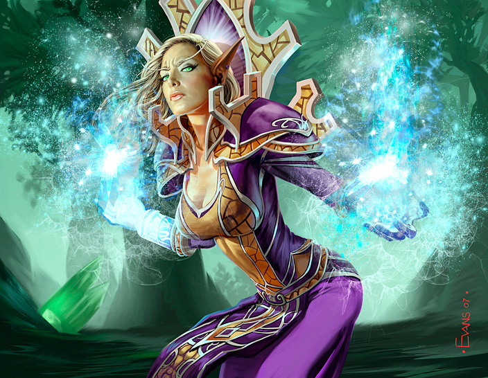
Great. So the two choices for the Green faction, which is tied to Forests and is thus the most “nature-ish” are both flavors of breastacular. And of course we have Mermaids, because Mermaids.

This is something that I actually found sufficiently irritating in our initial game (which has a suggested setup for faction selection when you’re playing with people who have never played the game before) that I refused to play female-gendered anything and played the Halflings instead as I didn’t want to deal with having to look at this bullshit cheesecake right in the middle of my damn play mat while I was trying to make decisions about how best to allocate my resources.

Now to be fair, the Witches do almost manage not to be bullshit. The fur bustier is pretty ridiculous, but she’s got a cloak and hasn’t been twisted into some ridiculous pose meant to show off her feminine “attributes”. It really wouldn’t have taken much for the witches to be actually not-terrible, unlike the Auren. She has the stiffest, most rigid breasts that are completely unaffected by gravity, and the drape of her garment only obscures enough to make things even more confusing. Like, where is her left leg? Does she have a left leg? What about her spine? What is it doing? And why is her torso such a perfect cylinder? That’s really not how ribcages work.

Even the Auren can’t compete with the Mermaid, though, who is so very broken that I decided it was time to do a redraw[2], since it’s been a while since I’ve done one of those. Looking at her, it seemed pretty clear to me that the artist had one priority in mind – show her breasts front and center and don’t let anything like “anatomy” or “perspective” get in the way of that.

I realize that the perspective of the pose does make it a bit difficult to tease out what’s going on here, so first let’s start with a draw-over:

Mermaid-anatomy-side

Looking at this, I imagine the artist’s inner monologue while drawing the Mermaid went something like this: “Face. Okay, hot, because no ugly chicks. Also, she’s a mermaid so we gotta see her tits. Arms? Eh, I dunno, let’s just half ass some shoulders and slap some arms on there. I can hide the one arm behind her hair and nobody will pay attention, because boobs, right? And then, I dunno. A tail. Who cares about that, you can’t have sex with that part, so whatever.”

[sigh]

So there are a lot of things that are just flat-out wrong, and all in the name of putting TEH BREASTS front-and-center. First, how about her face, which looks to be sliding down and to the left? Because if she is looking UP and to the RIGHT, her face should not be DOWN and too the LEFT. I know this may seem like a minor quibble, but given the number of factors that seem to point to the artist literally not caring about anything other than her tits…

Her arms are an even bigger problem, and seem to be tacked on mostly because that’s a thing that people are supposed to have, right? At first look, it looked to me as though her right arm was bending backwards, but now I honestly can’t tell which way it’s supposed to bend. I do know that with her upper arm at that angle, that degree of foreshortening on the lower arm wouldn’t be possible, because human elbows just don’t bend in such a way that her arm could possibly be correct. Her left arm is even worse – the artist just hid it behind her hair, waved his hands and said “foreshortening”. Which. No. Given that the hand on that arm appears to be the same size as the hand on her right arm, which is supposed to be much closer to the viewer, there’s no way that foreshortening would account for what is going on with that arm.

The biggest problem of all, however, is her damn spine. In order for the viewer to have that full a view of her breasts and for her tail to be at that angle, it would require actually snapping her spine in half at a ninety degree angle, not to mention that it would also require not actually giving her a sufficient ribcage in which to store vital internal organs.

Now part of any redraw involves actually correcting the pose once the flaws have been pointed out. However, back bends are difficult – sufficiently difficult that I’m turning to pictures of yoga from Wikimedia Commons to help me cheat:

yoga

This level of back bend is just about the limit of human bending ability, short of actual contortionism[3]. I happen to think that it’s pretty damn unlikely that a swimming Mermaid is going to voluntarily twist herself into this sort of position while swimming, but it is important when doing these exercises (at least it is to me) to honor the spirit of the pose and replicate it as close as possible.

Now this picture is a side view, rather than a 3/4 front view, but it was still useful as a reference of what should go where, once I flipped it around to the appropriate angle:

Corrected

There are several things worth noting here. First, regarding her breasts – when breasts hang – they become elongated and DO NOT retain a spherical shape. Admittedly, water would diminish this effect, but not eliminate it completely.

Second, when her spine is arched properly and NOT snapped in half, you should be able to see her rib cage clearly underneath her breasts. The breasts are flesh sacks hanging off the pectorals, which are attached to the front of the rib cage. They would not completely obscure the thing to which they are attached.

As for her arms, I can’t guarantee that they are totally correct – I would have needed to get assistance in having someone take my picture while I was twisting my arms around in front of a mirror, and as my neck and shoulders haven’t been too happy with me of late I figured I wouldn’t push it. However, while I’m not sure about her left arm (foreshortening is haaaard), her right arm should be pretty close to correct.

Lastly, her tail is where I’m on the weakest footing, given that I know human anatomy but am not not conversant on fish anatomy. Still, it seems that most artists draw the lower half of mermaids as though they were two legs fused with fish skin, so that’s the approach that I have taken – which means that her tail would not be able to fold in on itself to such an extreme degree.

Interestingly, when you look at my redrawn version, it doesn’t look all that much different – sure lots of things have been tweaked but the general structure has been retained, right? Well… Look what happens when I plunk the original pose (outlined in red) over top of the newly redrawn pose:

final

In deciding how to line her up, I made her head the same size as the redraw for the purposes of aligning the two versions. I nearly decided to use her breasts as the point of alignment, but that would have inflated her head to somewhat freaky proportions, so I left it as is. Which really emphasizes how incredibly squished this poor woman was. Anything that didn’t contribute to TEH SEXAY was either an extreme afterthought or completely removed.

Which, you know, call me crazy but if you’re going to sexually objectify women in your game art, can they at least look like real people? Because random assortments of ill-fitting body parts assembled in a haphazard fashion aren’t just unsexy, they’re creepy and unsettling. Which is distracting, when I am trying to figure out how to allocate my SEVENTY BILLION DIFFERENT RESOURCES in order to take my turn.


[1] Hundreds and hundreds of tokens! So many moving parts! Badly translated rulebooks that are confusing to parse! Super-complex strategy!
[2] And of course, having decided this I could NOT find my tablet’s stylus, so this was done using my old monoprice tablet. I apologize for the shakiness of the lines.
[3] As a matter of fact, I do know an actual contortionist who can sit on her own head. It’s weird and I refuse to call that a human ability, regardless of the fact that she is human and can do it. That level of contortionism requires some serious monkeying around with all sorts of stuff that usually does not get monkeyed with.

Anatomy: YOU’RE DOING IT WRONG (GenCon 2013 edition)

Recently, I had reason to take a good look at the GenCon 2013 poster that was drawn by Jonboy Meyers – a comic and game artist of some note[1]. The GenCon posters have long been a source of irritation for me, as each year the design centers around a scantily-clad female mascot. But until recently, I had thought of the 2013 poster as being “not as bad” as some of the others I’ve seen:

CLICK THROUGH FOR LARGER VERSION

And sure. There’s a lot wrong here. Her pose is weird and fanservice-y, the lens flare doesn’t completely obscure the fact that she’s wearing a miniskirt, and her “armor” seems to have individual boob compartments, not to mention that it’s rocking a severe case of sideboob. But bad as it is, she’s at least wearing more clothes than most of the other GenCon mascots I’ve seen? (Damned by faint praise, I know. I hope you realize just how low I’ve set the bar by now.) But then I took a really good look at it and realized, holy shit. There’s actually a lot seriously, seriously wrong with this picture.

So first, a drawover just to illustrate what’s going on underneath that overly-decorated-but-not-at-all-protective leather chestplate:

YIKES! Her breasts are weirdly enlarged, torpedo-shaped, and improperly placed and her ribcage is snapped in half just for starters. Neither of her arms are the correct length – her left upper arm is waaaaay longer than it should be at the expense of her forearm. I would say the situation is reversed with her right arm, except her right forearm is overly elongated but doesn’t actually connect to anything. There is no upper arm or even a right shoulder for it to attach to! Jonboy just lazily went “meh, boob” and counted on the fact that the viewer would be too busy admiring her chest to wonder about a small thing like WHERE THE HELL DID HER ARM GO?

What really kills me is the two different perspectives. The figure is drawn so that you are looking DOWN at the top of her head, but UP at her boobs. The effect is slight, but it’s there – which would only exaggerate the required spine arch of this pose to impossible levels. But of course, with torpedo collarboobs and floating arms it’s obvious that Jonboy was prioritizing SEXAY over, you know, anatomical plausibility.

(Which, can I just sidebar a second to say how gross that is? Look at this poor lady. She isn’t a person. She is literally a collection of disembodied parts, arranged for maximal titillation and shoved together in a mish-mash of lady-shaped sexy parts. Why do so many artists think that PARTS OF WOMEN are sexier than ACTUAL WOMEN?)

Ugh. Moving on.

Correcting the anatomy. Sort of.

So here’s the deal. I spent an embarrassing amount of time trying to do anatomically correct draw-overs of this pose and I still didn’t get it quite right. Sometimes in art, you can get something so wrong that there’s just no point in trying to fix it. You’re better off to just nuke it from orbit and start over. However, as starting over would defeat the point of this particular exercise, I did my best to persevere.

You have no idea how much it pains me to post something this terrible and wrong.

So when I started doing my corrected drawover, I discovered YET ANOTHER problem with this pose – this time with her shoulder. (The one that actually exists, not the one floating invisibly in space.) In order to be anatomically correct, you can keep the angle of the ribcage or the angle of the shoulder, but not both. In order to keep the line of the shoulder as drawn, you’d actually be looking at the figure from the side.

This would significantly change the shape of the torso. Not to mention you’d only be able to see one breast, and it would be a full on side view. (That I couldn’t draw correctly. The original lines were just too distracting. Aaaaargh.)

However, since Jonboy seems like the kind of artist who would prioritize seeing both breasts over something as unsexy as a shoulder, I figured it was okay to give up and spend more time on the 3/4 view correction.

This isn’t correct either, but at least it’s closer.

Looking at it, there’s still some problems with my version. Her waist is too narrow, and her left shoulder actually needs to come out further – the edge should be about level with the side of her hip. (I got led astray by the original lines. They’re so hard to escape!)

However! I did manage to correct the most egregious faults. Her arms are now the correct length and properly attached! No more weirdly floating disembodied forearms. Her breasts are also now properly shaped (assuming she’s got a decent sports bra). I know I’m always bitching about basketball-shaped breasts, but torpedo-shaped breasts are just going too far in the other direction. Lastly, I  also gave her some bits of anatomy that she’d previously been missing. Like a collarbone.

Now what’s fun is if I actually combine the two re-draws. The result is… pretty interesting.

Phew! This wound up being one of my more challenging anatomy corrections, despite that I initially thought it would be easy. And of course, now that I’ve spent some time with it, I have to wonder how I could have failed to see how grossly distorted her anatomy is. I guess it just goes to show how omnipresent this sort of nonsense is in gaming culture. It just sort of becomes the background radiation that you have to put up with in order to be a gamer, which is saddening.

[1] As I avoid comics precisely BECAUSE of the type of art he makes, I have no idea if Jonboy Meyers is A Big Deal in the comics world, nor do I especially care.

From the mailbag: Heartbreak & Heroines win, M:TG wtf

I’ve gotten a fair number of emails recently and things have been piling up faster than I’ve had time to blog about them; I still have notes lying around for that post about Shelly Mazzanoble I’ve been meaning to write, and I still do want to do a roundup of all of the LoL characters… But these are things that deserve mention, so I thought I’d shove two half-posts together about things I think deserve some attention but wouldn’t ordinarily fill out an entire blog post of their own.

Win: Heartbreak & Heroines Kickstarter:

Amusingly, here’s the part where I have to disclose that I do have a sort of tenuous non-connection with Heartbreak & Heroines. Back at a much earlier stage in the game’s development, the author actually originally approached me asking if I would be willing to do the illustrations. At the time I was very burned out on illustration and had several other creative projects that were consuming all of my energy, so I regretfully passed. Still, the concept was interesting to me, so I’m glad to see that it’s close to turning into a finished product.

What is the concept? Well here are some key paragraphs from the Heartbreak & Heroines Kickstarter:

Heartbreak & Heroines is a fantasy roleplaying game about adventurous women who go and have awesome adventures — saving the world, falling in love, building community, defeating evil. It’s a game about relationships and romance, about fairy tales and feminism.

Heartbreak & Heroines is first and foremost a fantasy adventure game. It’s not preachy and it isn’t a textbook about feminism, but it’s written from a feminist point of view. It challenges some of our assumptions about the role of gender in gaming but at the heart of H&H, it’s about being a heroine (or hero) and finding your way to happiness in a dangerous world.

This is the kind of stuff that makes me happy, and honestly the sort of angle that I wish more mainstream companies would at least consider when writing games – telling stories from the female point of view. Roughly half of humans are female, so it does seem to make a sort of sense that one would create games that would explicitly seek to encourage storytelling from a female perspective.

But all of this sounds like crazy-talk to quite a lot of gamers. So, you know, predictably a bunch of people over on RPGnet freaked out about the game and started flailing at strawmen. Because, you know, HOW DARE someone suggest that gaming isn’t the most inclusive hobby out there. And HOW DARE someone have the gall to write a game that attempts to tell stories from a feminist perspective. Didn’t they know that gaming is THE MOST INCLUSIVE HOBBY EVAR? What a bitch.

…ahem. [/sarcasm]

Anyhow, I could write more about why inclusiveness in RPGs is important, and why RPGnet is (as usual) a wretched hive of scum and privilege, but the fine folks over on The Designer Monologues already beat me to it with a very well reasoned and well articulated post which I hope you’ll go read.

I do want to take a moment here to mention, however, that Heartbreak & Heroines isn’t the first game ever to tackle storytelling from a female perspective. While mainstream RPG companies seem to have their collective heads very far up their asses, indie tabletop gaming offers quite a wide diversity of games that allow stories to be told from pretty much any perspective you can think of. For that matter, while the world of indie RPG design is still a world in which male designers outnumber female designers, you don’t see the kind of tokenism that you do in mainstream game companies.

So specifically I want to mention that if the idea of a game that encourages feminist-friendly storytelling from a female perspective is one that interests you but Heartbreak & Heroines doesn’t seem to appeal to your personal preferences, don’t be discouraged. If you’re into period romances without the fantasy adventure bits, might I recommend Kagematsu as another game that is explicitly designed to tell stories about female characters, albeit with a bit of a gender-bending twist.

And if that doesn’t float your boat, there are so many good indie titles out there by great female designers. I could try to list them, but I’d leave awesome people off the list and that would make me sad, so I’ll just say that as full of fail as companies like Wizards, Paizo, Green Ronin, White Wolf et all are… there’s some good stuff to be had out in indie land. (And bad stuff too – no one’s perfect. But much less bad stuff overall.)

Fail: some M:TG wtf

A reader sent me a link to this blog post about Azure Mage over on the official Wizards site. As you might have guessed, the post features prominently the Azure Mage, from the Magic 2012 card gallery:

What the… but… she isn’t… those don’t… ARG!

Okay, so clearly the artist has not been reading Boobs Don’t Work That Way. Boobs are sacks of flesh attached the chest, not whatever the hell this guy is drawing. Without a bra, there is no way she would have this much cleavage. Cleavage just isn’t natural without some sort of support pushing breasts together; as sacks of flesh and fat, breasts tend to hang separately. They’re not magically attracted to each other like magnets.

Also, one assumes that those stupid silver buttons are meant to cover her nipples, which is just so very wrong. Nipples are not ON TOP of the breasts, they are generally toward the underside. Another reason her breasts are just plain freakish is her complete lack of areola. With that much exposed tit, we’d be seeing at least some areola – especially as the “nipple-concealing buttons” are in entirely the wrong place to actually conceal her nipples.

Lastly, her rib cage DOESN’T EVEN CONNECT TO ITSELF. Seriously, check this out:


It’s like the artist realized that without a bra, SOMETHING would need to push the two breasts together and then failed to remember that the arm connects to the shoulder, which connects to the rib cage… I mean, it’s not that hard. Remember the song we all had to learn in kindergarten? Maybe the Wizards artists should have to prove they know the song in the first place to get hired on…

So this is bad enough, but I had to laugh at the image that was pointed out to me at the very bottom of the article:

Were they seriously trying to rip off Crapping Frost Mage? I can’t think of any other explanation for this picture. I mean, honestly. As little sense as the Stripper Pole Dancing school of spellcasting makes to me, it at least makes more sense than the Taking a Dump school of spellcasting. Now, admittedly I might be too jaded to be an objective judge of this sort of thing, but I fail to see how this pose would be attractive on any real woman ever. Even her expression makes her look like she’s trying not to crap more than she’s concentrating on mastering arcane forces.

I never thought I’d see the day when Crapping Front Mage had competition for the most ridiculous crapping pose ever, but it looks like that day is here. I guess, this being the internet and all, I shouldn’t be surprised.

GMMaS returns with a look at Forsaken World

The hiatus

Hi, folks. It’s been about two weeks since you heard from me. I was off dealing with a death in the family. Now that I’m home again, I can get back to blogging – though the schedule might be a bit unpredictable while I’m catching up on all the real-life stuff I’ve been ignoring since dropping everything to deal with other stuff.

On to the mocking: Clothing disparity

Forsaken World is a new offering from Perfect World Entertainment that is either in closed beta or newly released (the few sites I bothered checking out disagreed and I don’t really care enough to spend time verifying that particular detail). Some of you may remember that I posted previously about Perfect World and its freakish body customization. Thankfully, Forsaken World does seem to be free of that particular feature, although it’s chock full of other problems.

The first and most obvious of these problems is the classic fully-covered male versus wearing-almost-nothing female that plagues so many free Chinese and Korean MMOs. Forsaken World doesn’t disappoint in that department:

The top left image is disappointing in particular because the armor is so great from the waist up. It has the same coverage (again, from the waist up), has a lot of visual interest, and her boobs aren’t humungous. It’s almost like she’s a completely different person from the waist down, what with the spread legs, plate mail stripper boots, and Inexplicable Codpiece. (What purpose do codpieces serve on women? To call attention to the fact that they’re not wearing pants?)

On the bottom we also have a classic example of how female vampire = SEXAY while male vampire = modestly attired, which is another stereotype that I wish would die in a fire. What is it about vampirism that makes women dress in as little clothing as possible? I mean, I get tired of men staring at my boobs when I go to conventions and I’m dressed normally. You’d think that after a few centuries the lady vampires would be about ready to kill anyone who stares at their tits when talking to them, but maybe they’re newly undead and playing around with the stereotypes. Who knows.

Anyway.

The worst comparison is this official wallpaper here:

Seriously? What the hell is this? Okay, sure, the guy on the right isn’t wearing pants. And he’s even showing some nipple, that is, if I could FIND the nipple. (Srlsy, where is it? Does everyone have weird Barbie/Ken-doll anatomy in Forsaken World? And if so, how do they reproduce?) But you know what, that’s a far sight from the chick on the right who’s got a thong and some art-deco nipple pasties. Wtf.

Then again, I’d have trouble taking any game seriously that had this character as a quest-giver:

Additional fail: creepy sexless breasts

Something else I found irksome is the prevalence of creepy sexless breasts like one would find on a Barbie doll. Now a lot of artists do try to ride that fine line of just barely covering up the nipple with some cleverly placed hair or a strap or some such, but there’s something else you asshats are forgetting about. THE F*CKING AREOLA.

In both of these outfits, there should be partially visible areola on at least ONE tit. So please, for the love of god male artists out there, learn how breasts work, okay? And don’t use porn as reference because, guess what? WE CAN TELL. (Try consulting this awesome Tumblr for examples of shit NOT TO DO when drawing breasts, too.)

A (lengthy) aside: artists aren’t the only problem

I just wanted to mention that I pulled the screenshot on the right from a blog hosted on IGN.com. It doesn’t appear to be an official IGN blog, so I won’t link, but suffice to say that the post in question described how they rolled up a new female vampire character and promptly got harassed by two morons who followed them around and yelled “BOOBIES” for approximately half an hour, making enough of a nuisance of themselves that they had trouble questing. And yet, at the end of the post the author concludes that they want to see more skimpy armor and cleavage because the art style is JUST SO PURDY.

/facepalm

A lot of the time I reserve judgement for the artists who, frankly, should really know better. If you’re getting paid to draw tits for a living, you should know how they work. But at the same time, I can’t deny that some users really are part of the problem.

/end aside

The worst fail of all

I found this gem while going through the wallpaper section of the Forsaken World website. Originally I had only intended to do some comparisons and mock screenshots, but I was stupefied by how bad the anatomy in this photo is. I mean, sure you have a mostly naked mage doing some Butt Wiggling Spell Casting, and sure the naked chick ON HER SPELL BOOK is a “nice” touch, but the anatomy is just so bad that even Crapping Frost Mage just can’t compete. I realized that I simply had to do an anatomy correction on her to point out just how terrifying she is.

So here in green (without the underlying image, since the colors are too varied to make it show up well) is a trace of the figure as it would be underneath the clothes/hair:

Oh my god, people. Had I ever turned in anything this bad, I would have been failed out of art school. I know I harp about artists who refuse to draw breasts as objects affected by gravity, but this poor woman has the breasts of an 80 year old. Even worse, she has 80 year old breasts on an anorexic torso, an obese butt and thighs, and freakily distorted Dhalsim arms.

Just to make my point, let’s throw our freaky fat/anorexic/elderly Dhalsim-elf up next to what is surely a photoshopped photo of Selma Hayek:

Now look at how absolutely perfect Selma Hayek’s abs are, free from any wrinkles, ripples, or hints that she might have fat cells anywhere other than her boobs. (Like I said, photoshopped.) And even our artificial Selma Hayek has a waist that is MUCH WIDER than her head. I’m not sure why this is so hard for artists to grasp, but if your waist is skinnier than your head YOU ARE NOT SEXY. You’re just a freak. Also, the human arm is approximately the same length from shoulder to elbow as it is from elbow to wrist. There’s variance, sure, but not that much.

The hips I’m going to make a bit more of a tentative note. Hip width as compared to shoulder width varies quite a bit in humans, especially in women. However, it is entirely impossible for our freakish elf to have these proportions and be a living person rather than a Barbie doll. You can’t go from a waist narrower than your head to hips that are 1.2 times the width of your shoulders without enough corseting to risk serious internal injury. It’s just not anatomically possible.

So let’s look at the original traced figure with corrections:

On second viewing, I think I may have made her boobs slightly gravity-defying, but other than that I’m pretty happy with how this turned out. not only does she have room for organs, she also has enough arm muscles to lift things heavier than a newspaper. And happily, she has normal human proportions. Granted, the pose is still complete garbage, but you can’t exactly make a silk purse out of a sow’s ear.

Anatomy: YOU’RE DOING IT WRONG (WoW)

I’m actually working on a post that’s not about video games, but unfortunately it’s going to take more time than I have today to do the research. So instead I’m doing a quickie anatomy lesson picking on World of Warcraft. I was tempted to pick on Crapping Frost Mage again, but considering that I used it for a gender swap already I decided that would probably be cheating. (Also, it would be like shooting fish in a barrel.) So I went with this wallpaper instead, which features one of the oldest pieces of promo art still in use from the first game:

Oh man. Where to begin…

So first of all, note how small her head is. Now because her feet are cut off, it’s a little hard to tell exactly how tall the figure is, but the average human is 7 heads tall and she is definitely way taller than that. There is some variance to be had, some people don’t conform to 7 heads exactly. But the difference is also never that large. Also, she’s got a serious case of gravity-defying sphere-boob as well as some missing organs:

If you stack the heads up and make an estimated guess of where the feet would be, it looks like she’d be around 8-8.5 heads tall, which is just kind of freakish. I know that those proportions are commonly used by comic artists in order to make the female figure more “statuesque”, but that sort of thing is ridiculous in my books. I want my women to look like actual women, not statues.

Also of note, her waist is actually narrower than her already too-small head, which kind of freaks me out. There’s no way she’s wearing a corset, because that would require her midriff to actually be covered. Unless she’s using magic to create a magical corset forcefield, which just seems like a waste of energy. I mean, aren’t adventurers in WoW supposed to be out to conquer evil? Corset spells seem like they’d just be too big a drain on mana.

Now, interestingly, even the artist seemed to be wrestling with the results of the too-small torso, because he attempted to make the shoulders wide enough to support the head and overcompensated. The result is that if you follow the curve of her back and ribcage, her shoulder isn’t actually connected to her ribs. Her arm is apparently just floating in space, which I’ll admit is a pretty neat trick. I imagine it comes in handy for getting things off of high shelves if you can pop off your arm and send it floating around.

And, of course, she has sphere-boobs that practically have their own anti-gravity fields, but that goes without saying at this point, I suppose.

So with all of these things in mind, I sketched my corrections on top of the image:

Now I’ll admit that I think I may have made her a bit on the unhealthy side if she’s anywhere past about 18. If she’s still got a teenage metabolism, then this is fine and healthy, but if she’s older then not so much. But we’ll presume that summoning arcane forces burns calories and call this close enough. Even with a potentially problematic waistline, you can see the vast difference between this figure and the original. Her waist is not quite double the size, and her boobs are actually affected by gravity now.

And just to make that a bit easier to see:

Yikes. That shoulder thing is just weirding me out. If you’re going to continue making ridiculous cheesecake art, Blizzard, can you at least make sure that their joints all connect correctly?

>Anatomy: YOU’RE DOING IT WRONG (Chun Li)

>I felt like it was time to use my artistic powers for good again, so I went looking for another image to correct. (Note to my readers: don’t EVER Google Image search Cortana. Yuck.)

Amusingly, when I was looking for characters to mock for another lesson in how game companies are doing it wrong, I had initially thought I was going to pick apart the Dead or Alive girls. But then I was looking through all the DoA cheesecake I could find and discovered… no… they’re anatomically correct, as long as you assume that they’re doing around two hundred crunches a day. They’re disgusting, but not actually inhuman. Check this out:

She’s got big boobs, sure, but they’re not perfect spheres and they are affected by gravity. Furthermore, she has a ribcage and actual organs. So Capcom, you should be doubly embarassed that I’m picking on you today. If you’re lower on the food chain than Dead or Alive, then I think that really says something.

I wound up settling on this picture of Chun Li after I found this photo of an official Capcom figure of Chun Li. It’s currently $75.00 on the Capcom store:

Okay, so before I pick on anything else, just check out how small her head is. It’s smaller than those ridiculously puffy sleeves of hers, and way too small for her body! The average human is about 7 heads tall. This Chun Li is almost 8 heads tall, which combined with her exaggerated proportions makes her look bizarre and inhuman. So first of all, before doing anything else, I PhotoShopped her head to the correct proportion:


Uncorrected on the left, corrected on the right.

You’ll notice that already that does a lot to make Chun Li look more human. Now the only problem is that her costume, with its ridiculous sleeves, makes it hard to tease out the actual anatomy. So I’ve drawn in her actual anatomy over the corrected 7-head-tall figure:


Chun Li’s sculpted anatomy is in red, along with my notes in green. First, you’ll note that Chun Li’s ridiculous thighs are actually 7/8 of the height of her head, despite having such waifishly thin arms that she looks like she’s not used to carrying anything heavier than a newspaper. Second, you’ll note that Chun Li’s ass is precisely the width of her shoulders, despite the fact that her waist is approximately the width of her head. So like Taki, Chun Li has no rib cage. One supposes she’s storing her organs in that prodigious ass of hers.

All of this is, I suppose, sort a refreshing change. For once it’s not the boobage that’s being completely distorted. But still, this is entirely unrealistic.

So, time to make corrections:

I gave Chun Li some more muscular arms. I figure if she’s going to be smacking people around on a regular basis, she should at least have guns like Michelle Obama’s (who I modeled Chun Li’s new biceps on). I also toned down her absurdly muscular thighs, though I left them plenty muscle-y. As someone who takes tae kwon do, which is much more about kicking than blocks or punches, this is a much more reasonable physique for a practitioner of martial arts whose technique focuses heavily on kicking like Chun Li’s does.

Lastly, I gave Chun Li a freaking rib cage. Once I did that, I didn’t need to correct the boobage, and I only had to tone down the ass just a bit. I left Chun Li’s washboard abs. I’ll cut these fighting game girls some slack and assume that they’re doing a regime of crunches so as to be in better shape for all that ass-kicking. (Oh, and I also de-muscled Chun Li’s knees since they just looked absurd.)

I realize some of that is a little hard to see, so for the sake of clarity:

(I couldn’t resist adding some shading to make it pretty)

So this is just to illustrate the adjusted proportions. When properly proportioned, her ass is still 3/4 the width of her shoulders, and her thighs are 3/4 the height of her head rather than 7/8. When you look at it this way, it’s really not a huge difference. My Chun Li is still thin, muscular, and athletic and still manages to be attractive. And most importantly, she’s human! So let this be a lesson, Capcom. I’m not asking you to make huge changes. Small changes like these would be great.

>Better character designs: Sophitia

>My plans are to make this a semi-regular feature. I won’t promise a regular schedule of these, since my muse is a fickle creature these days, but I will promise that this won’t be the last.

Okay, remember Soul Calibur VI’s freakishly proportioned jiggle-fest Sophitia? Of course you do. (Who could forget? Brr.) But just for the sake of comparison, here she is again:

If one considers that the human head weighs around eighteen pounds (thank you, Google), then it looks like she’s carrying around 54 to 72 pounds of boob around there. Just for a little perspective, guys, you can understand how difficult fighting with those bazookas would be by strapping a nine-year-old to your chest and trying to swing a sword while so encumbered. At that size, the boobs would be about as rambunctious as the nine-year-old.

So here’s my take on Sophitia as she should have been. (And apologies for the sketchiness and the somewhat ghetto coloring job. I didn’t feel like taking the time to make it a finished piece.)

(CLICK FOR LARGER VIEW)

My Sophitia is regularly proportioned, but still quite sexy. Her proportions are athletic without being waifish. My Sophitia has never had breast enlargement, and she isn’t averse to eating a freaking burger now and then.

The other huge problem besides the anatomy is the white-washing. How about the fact that she’s explicitly Greek by her story and costume, and yet she’s a paragon of Aryan beauty? Seriously, wtf? Mediterranean people are brown. (In fact, my Sophitia might not be quite brown enough. I struggled getting the right skin tone with only photos for reference.)

Lastly, I also changed her costume. If she’s a Greek warrior, why invent some bullshit faux toga for her to fight in? Why not clothe her like an actual hoplite? Hell, the hoplites pranced around with no pants on and short sleeves, so you’d have a historical excuse to put her in a fanservice-y outfit. Make the skirt on that bad boy a little shorter and you’d still be within the realm of accuracy.

So that’s Sophitia. Any suggestions on who I might tackle next?