Publishers: STOP HIRING ARTISTS WHO CAN’T FOLLOW DIRECTIONS

So before I start, two things:

  1. I’ll cop to the fact that this post is inspired by the series I just completed on Pathfinder – but it’s not about Pathfinder, if you catch my meaning. The problem that I’m writing about is a problem for the entire industry, not just for one or two companies.
  2. While I use particular examples, this isn’t me saying we need to run certain specific people out of the industry, although I’m pretty certain some people will hear just that. I can use someone’s work as an example of what not to do and still not say they should be run out of the industry with torches and pitchforks.
  3. I am NOT saying get rid of all sexy art in games ever, okay? FFS.

Now that that’s been said, let’s move on to the matter at hand:

When addressing the issue of “how does bad art get past a strong art director”, the thing that comes up again and again is the short timelines to produce a finished product, and not having the luxury of sending a piece back to an artist time, and time, and time again until they get it right. The number of times I’ve heard publishers say things like “sometimes you ask for a strong armored black woman in plate armor and you get porn”, and just shrug it off like there’s nothing to be done about it because that’s just the way things are… It’s kind of astonishing.

Take, for example, this comment by Erik Mona on a long-ago post about Pathfinder:

…we generally give our artists a loose rein to draw what pleases them, and the fact of the matter is that lots of artists, especially the younger male ones who like to draw stuff for comics and gaming companies, are fucking perverts. It must have something to do with all of those life drawing classes they take, or their focus on the human form, or whatever. As a class of people, artists are generally pretty filthy. The number of times over my 10-year career in this industry that I’ve had to send back an image with a note like “um, thanks, but can I get this without hard nipples showing through the leather armor, please?” would shock just about everyone… (full comment can be viewed here)

And trust me, this mirrors pretty precisely what other highly-placed publishers both at large “mainstream” companies and mid-to-large indie outfits have told me[1]. This is a problem that isn’t just widespread – it’s endemic. This results in the sort of cheesecake where the artist was obviously not following the spec, like these images:

NotSpec
LEFT and MIDDLE: art by Wayne Reynolds; RIGHT: art by Eric Belisle

(You’ll note that two of the three example images I’ve picked are by Wayne Reynolds. I’ve even joked in the past about calling this Wayne Reynolds syndrome because he’s particularly bad for depicting women as sexual that were obviously meant to be depicted as powerful.) Check out these examples. In the first, we have a pirate that is meant to be sword-fighting some kind of were-shark, but instead she is contorting into the most spine-breaking boobs-and-butt pose imaginable so that we can see her incredibly unrealistic cleavage AND her panties. In the second, we have a female orc who is meant to be seen as a powerful warrior, shown in medium armor and bristling with weapons, with boobs that are perfect spheres, and are about 30 seconds from popping out of her chainmail top. And in the third, we have a character that is clearly meant to be shown as a capable mage, with a collection of scrolls and a magic wand, but instead she is being shown as baring midriff and sideboob in one of the most gravity-defying fantasy outfits I have yet seen.

AND IT’S A REAL PROBLEM.

It’s a problem for the intended audience of the product, because of how the product is perceived – in this case as being sexist. A few isolated examples here and there are one thing, but in the aggregate – given the large scale of this problem – it signals that certain game products are not safe for or welcoming to consumption by women. Some women will buy the product anyway, but a significant number will choose to invest their money in products they feel are more respectful in their depictions of women.

It’s also a problem for the publishers, because the potential loss in sales and long-term damage to the brand’s image of inclusivity isn’t the only factor being weighed. Whenever a publisher gets a sexualized image that is counter to what they asked for, it puts them in a situation where all of the available options suck. Do they throw their timeline out the window by sending the art back – something they might have to do multiple times, depending on how truculent the artist is being? (And trust me, some artists will flat out refuse not to sexualize their images of women.) Or do they roll their eyes and stick to the time line? Both choices are bad! PLUS, the artist is putting them in a situation where they have to spend extra time and energy to evaluating “how much of a problem is this”.

Faced with such a situation, most publishers tend to opt for rolling their eyes and moving on. (They might send it back once, if they have “lots” of time, but then go with whatever they get.) And as much as I rail against the glacial pace of change in tabletop game art, I can’t say that I entirely fault the publishers on that front. Publishing is a tough business! Gamers expect huge value at bargain basement prices! The margins are incredibly narrow, and all it takes is a small mistake for you to end up eating your shirt on a game. (Hell, even if you do everything “perfectly” as a publisher, it’s possible that circumstances entirely beyond your control can still entirely fuck your profit margins.) Breaking a committed timeline can be hugely expensive! So mostly, the people who can afford to be principled and “get it right” are the indies[2] – most of whom have day jobs and aren’t relying on publishing as a primary income.

That said, much as I understand the short-term decision to accept the individual piece of art in the name of getting a product out the door, the fact that the industry as a whole has put up with this incredibly widespread phenomenon as being a thing for so very long is baffling! Publishers will say things like “well what can you do” and “we have no choice” – as if there’s nothing that can be done about a problem that MOST publishers say they want to change, and which has persisted for decades. And then even after an artist gives them art that does not meet the spec that was requested, publishers will continue hiring the same artists over and over again! And that is BONKERS, because that kind of blatant disregard wouldn’t fly for creative work in any other industry. It’s unprofessional, and counter to the interest of the publishers who hire them.

For example, if I hired someone to design a logo for my furniture business and I got back a cleavagey woman humping a couch, I wouldn’t pay for that – it would be a violation of what I asked for. And I definitely wouldn’t say “I should give them more business” once that transaction was complete!

The helplessness with which publishers discuss the phenomenon of rogue artists is doubly frustrating given that ARTISTS ARE NOT UNICORNS; they aren’t some rare, incredibly precious commodity that must be guarded and protected at all costs. In the recent artists all-call that Ryan and I did for Katanas & Trenchcoats, we had eighty-five portfolio submissions. We’re STILL working on narrowing down who we want to work with, because the level of skill among the submissions is incredible! (Seriously, this is a good problem to have.) And yet, because we made such a focus on emphasizing that we wanted diverse applicants, a good many of them are people whose portfolios are deep and impressive, but their illustration experience lies outside the games industry.

Now it’s important to be clear. Sometimes there is miscommunication between publishers and artists that leads to delays that isn’t the artist’s fault, and publishers should ABSOLUTELY not throw their artists under the bus when that happens. Trust me, as someone who has done freelance game illustration, I feel that very keenly. Sometimes publishers ask for a draft, then flat out change their mind. Sometimes what is needed isn’t clear and it takes some back and forth to discover what that is. And that’s fine! I’m talking only about bad-faith approaches to art specs, because the people I’m talking about are repeat offenders. They do this shit over, and over, and over, and over again – and it shows quite clearly in their body of work.

Admittedly, finding new artists does take work. As you might imagine, going through 85 portfolios, narrowing down which artists would be a fit for your project, and deciding from there is something that takes a lot of time! And a lot of publishers have a stable of artists that they like to work with – artists that they know and have worked with in the past. Given the volumes of art required for a typical game book, which can have hundreds of full-color illustrations, going back to the same artists you’ve worked with in the past is just one less decision that needs to be made.

But in the long run, getting rid of artists who can’t follow the instructions you give them for what you are looking for in an illustration will pay off. You’ll get art that matches your creative vision, that doesn’t tarnish your brand by association, and that doesn’t force you to choose between satisfying your morals and honoring business commitments. (Because the thing is, every publisher I’ve talked to will say this is a problem, and that they would like to see it change.) As long as everyone’s response is to throw their hands in the air and claim that NOTHING CAN BE DONE, no substantial change will ever be made!

As publishers, we can make things SO much better by simply insisting on the absolute minimum standards of professionalism when dealing with artists; if your artists can’t be bothered to give you, THE CLIENT, what you are asking for, tell them that you need them to pay attention to the specs as written. And if they still don’t follow it? Fire them and hire a different artist.

[1] This tends to be less of a problem for micro-publishers like myself, because micro-publishers tend to either 1) do the art themselves 2) use stock art 3) work out a trade arrangement with a friend who won’t fuck them over. There are exceptions, sure, but any time you have a shoe-string budget, you end up doing more yourself, which means you keep more CONTROL to yourself.

[2] There are exceptions, of course – Evil Hat, Pelgrane Press, and Magpie Games being the most notable.

Pathfinder Art (Part 3): What… I… Just… No.

[Notes: Some problems with my language were pointed out, and I have some made some revisions accordingly. WRT calling Roma “gypsys”, that was my bad. I knew better. As far as “heebie jeebies”, that was something I wasn’t aware of as being a problem.]

In my last post, I did an analysis of art from a few Pathfinder books to look at the differences in how men and women are portrayed, and how that sheds light on sexist trends that are present in Pathfinder art. This post was done according to my usual methods, and you can find a whole lot more such posts by searching the numbers tag here on my blog.

Now, numbers will only take you so far – which is why today’s post will look in some pretty extreme depth at art in these books and why saying simply “the art in the three books I examined displayed clearly sexist trends” is, if anything, understating the matter. I’ll be talking about specific issues with the artwork in order of increasing awfulness, from “ick, really?” to “what the actual fuck, gross”.

(And as always, click through the images for a view with more detail)

Gross Trend #1: The prevalence of sexualized character design

Because it’s supported by the numbers that were gathered, I can say that “in the NPC Codex and Inner Sea World Guide … women were about twice as likely to be suggestively attired as their male counterparts”. But that statement alone doesn’t really convey the sheer stupidity of so many of these pieces of artwork, where the spec obviously called for “heroic avatar” and the artist, instead, turned in “hurr hurr tits”.

The least offensive example I have of this is boobplate, which was depressingly prevalent:

Boobplate
These are just the MOST INFURIATING examples of boobplate, btw. I had a depressing variety to choose from. (Click for larger view)

I don’t think it’s necessary for me to cover yet again why boobplate with individual boob pods, or boobplate with a boob window is a terrible fucking idea[1]. But I think it’s worth pointing out that the Haughty Avenger’s boob window is actually one of the least offensive (in my opinion) of the images that I picked out. The Ice Maiden, with her Madonna-esque metal brassiere over her armor, strikes me as being just as gross, despite not actually being able to see any skin. The Tribal Champion and Bloodfire Sorceror are similarly frustrating, given that they also have metal boob pods over other armor – although theirs at least aren’t cone-shaped. And the Heir Apparent… [facepalm]

The Heir Apparent is possibly the worst drawing of boobplate I have ever seen, which is impressive, because I’ve been writing this blog a long time and have looked at A LOT of really bad art. First of all, her breastplate seems to also double as a corset, judging by the otherwise impossible narrowness of her torso and waist. More important, however, is the fact that her armor’s boob pods are distended and lemon-shaped, which… you know… just… no. Breasts can be shaped like a lot of things! They’re all different! But NEVER distended protruding lemons, because that’s just not how gravity works. So the stupidity of drawing protruding-lemon boobplate is just staggering.

But of course, boobplate isn’t the only kind of frustratingly sexist character design. That comes in a wide variety of flavors!

StupidOutfits

A spear and shield fighter who doesn’t wear any goddamn pants! A huntress who punches things with magic fire (?) while wearing a bra and hot pants! A cleric who dual wields crossbows while wearing a drab-colored evening gown that require a lot of garment tape to prevent wardrobe malfunction! An embarrassingly racist Asian elf whose leotard is meant to be sexy but mostly looks like an adult diaper! A lizard person with tits in a bustier[2]! Boobplate is just one tool in an artist’s stupid sexualization tool kit! The number of ways that a female character can be reduced from “heroic avatar” to “sexual object” are almost limitless!

[facepalm]

It’s worth noting that this sort of thing can get unintentionally hilarious when you have a particularly egregious example of sexualization in the same 2-page spread as a male cover that is completely covered from wrist to neck to ankle:

DumbestSpreads

[siiiiiiiggghhhhh]

Gross Trend #1a: Impossible breasts

The fact that so many artists insist on needlessly sexualizing the women they draw wouldn’t be nearly so infuriating if they bothered to put in the least bit of effort into understanding 1) how breasts work 2) how gravity works 3) how breasts and gravity work in combination with each other. Breasts are sacs of flesh and fat that hang from the pectoral muscles. This means that they hang down and slightly away from one another. BREASTS DO NOT HAVE THEIR OWN GRAVITY. They don’t pull themselves into perfect spheres. They don’t magnetically stick together to form cleavage without a garment providing A LOT of structure. And gravity pulls them DOWNWARD. Which is why all of the following is just plain inexcusable:

DumbestBoobs

No. No no no NO. The only one of these that is even CLOSE to correct is the halfling on the far right, and even then her breasts are doing some uncanny valley shit where they’re close to correct, but just wrong enough that they’re giving me the heebie jeebies willies.

Sadly, even when artists manage to get the structure of breasts right, they often fail to consider how breasts + gravity will interact with the clothing being worn. For example, while the following images actually manage to not screw up the actual breasts (too much), all of them would be a hot mess the instant any of these women tried to actually do anything:

FabricTape

The Battle Skald’s outfit is the most practical/realistic of these trainwrecks, but even that isn’t saying much. With no underwire or other supportive structure, the fact that only two stitches hold the two halves of her top together means that she’d get maybe a few swings of that axe in before having some severe wardrobe difficulties. As for the Undead Slayer, I will at least give the artist points for structuring her outfit such that they managed to have visible underboob without having to worry about areola or nipples[3]. However, the Undead Slayer, the Vivisectionist Cleric, and the Seductive Enchantress will find themselves popping right out of their tops, because BREASTS ARE AFFECTED BY GRAVITY. Without a structuring top like a corset or supportive bra, breasts move around a lot.

There’s also the issue that AREOLA EXIST – covering the nipple doesn’t render them magically invisible. Further, NIPPLES ARE THINGS THAT HAVE THREE DIMENSIONS. They are protruding fleshy bits! So there should absolutely be nipple showing through both the Vivisectionist Cleric’s and Seductive Enchanter’s “tops”.

Tl;dr, LEARN HOW BREASTS WORK. The internet has a wealth of examples you can learn from.

Gross Trend #2: Women aren’t heroes

As I pointed out in my last post:

…when looking at the Inner Sea World Guide … 34% of all women can be said to fit into a class archetype – which is ALL KINDS OF DEPRESSING when you consider how incredibly underrepresented women are in the Inner Sea World Guide as a whole. There are vast swathes of the book where there are no women at all, and when women DO show up, fucking TWO THIRDS OF THEM aren’t even heroes or adventurers. They’re fucking barmaids, peasants, princesses, and slaves – which is some creepy woman-erasing misogynistic bullshit.

That alone is bad enough! But even worse is the fact that A LOT of these non-heroic women are also objectified. Most women can’t be heroes, but they can be sexy barmaids?

Barmaid

And sexy slaves. And sexy princesses. And sexy human sacrifice victims (more on that in a bit). Welcome to Golarion! Where the men are heroes and the women are fuckable! …which is fucking horrific when you consider the overall lack of women in the books in the first place. [brr]

Gross Thing #3: Quotas and Interchangeable Women

As I mentioned in my previous post, one of the major problems with representation in the books I examined was the fact that so many group scenes contained only 1 woman. This is pretty aggravating when the lone woman is shown as a hero or other avatar figure, but when they’re shown as something else, things can get pretty gross.

Take, for example, these examples – in which the ratio of male figures to lone female figures was particularly egregious: 

Only1

In the left image and the bottom right, the lone women in the scene are at least shown as heroes. But in the top right, our lone woman is shown as an imminent victim of human sacrifice, which is just all kinds of wrong! Apparently the answer to “where are all the women in Golarion” is WE MURDERED THEM?

But then, it’s not like any of this is entirely surprising given that women are so entirely unimportant that they are completely interchangeable. After all, one sexy woman is as good as another, right?

Sameface

There were no less than six pieces in the Inner Sea World Guide by the same artist of ostensibly different women who had the same damn face. Because who cares about depicting women as individuals with their own unique characteristics and attributes? Really all that matters is that they’re sexy, and so long as that requirement is fulfilled, they can be assigned a generic face. That’s the bit that no one cares about (as long as it’s sufficiently aesthetically pleasing), because sometimes words come out of it and that’s gross.

…obviously I’m being sarcastic here, but sameface syndrome is something you almost always only see in illustrations of female characters. And it’s something that I would expect an art director to be more on top of, when dealing with a large number of images from the same artist.

Gross Trend #4: Embarrassingly Racist Art

Last, but most certainly not least, was the distressing prevalence of racist art. Starting with CODING ALL OF YOUR BARBARIANS AS CRYPTO-NATIVES:

Racist

NO. NO NO NO. NO.

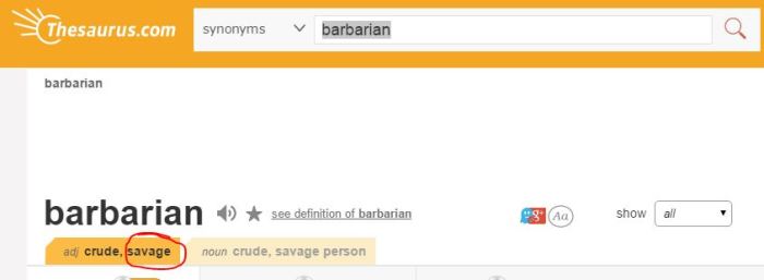
“Barbarian” is literally just another way of saying “savage”:

barbarian

The stereotype of Native peoples as savage devils is one of the most pernicious, destructive, racist stereotypes out there. It directly led to the genocide of Native peoples by colonialist forces, the establishment of the Canadian residential school system – which was only shut down in 1996, as well as a legacy of racism and structural injustice for natives. So coding Barbarians as Native is bad, but making a subset of those Barbarians a CANNIBALISTIC EVIL MATRIARCHY??? NO. Just. NO.

Sadly, I wish I could say these were the only example of gross racism, but… no:

MoarRacist

Oh good. A sexy gypsy Roma – a trope almost as gross as “savage” Natives – and evil crypto-Arabs. (There are A LOT of game products that even call them “gypsies”, which at least Pathfinder didn’t do – since “gypsy” is an actual ethnic slur.)

That’s nice. At least the racism is well rounded.

In Conclusion

I parted ways with D&D quite a while ago after discovering indie table top games – not because indie games are “better” per se. But because the complexity and crunch of D&D and other systems like it or derived from it, as is the case with Pathfinder, just didn’t do it for me. But even if that were the case, I don’t think I would feel comfortable picking up these books, or recommending Pathfinder to someone just getting into games for the first time – because this is the kind of shit that makes me embarrassed to be a gamer.

[1] If you’re struggling with “why is boobplate bad”, then this probably isn’t the blog for you.

[2] LIZARDS SHOULDN’T EVER HAVE TITS. THEY ARE NOT MAMMALS. YOU ARE DOING IT WRONG.

[3] Because nipples WILL be visible through a lot of fabrics

Pathfinder Part 2: Looking at Art in Pathfinder Material [CHARTS][LONG]

[EDIT TO ADD: I realize some people are going to look at it and say “so what, two of these three books are older books”. However, what I feel makes it pertinent are the fact that the numbers from the newer book in the lineup are right in line with the older book. And, to slightly mangle one of my favorite Tumblr gifsets, it’s not exactly like women hadn’t been invented yet.]

[Edit 2: In the comments, Jean-Francois was kind enough to point out that I’d made my charts for suggestively attired and fully covered using absolute values and not percentages, which was completely my mistake in selecting the wrong fields to pull data from while making the charts, and then writing about the incorrect charts. This has now been fixed.]

Recently, I wrote about my experiences in trying out the Pathfinder Adventures card game app, which was released several weeks ago. Unfortunately, the sub-optimal experience created by the already confusing and buggy UI was made worse by bafflingly sexist art which I had no option to escape or avoid. And that was confusing! I don’t play Pathfinder, since the system makes me cranky, but I’ve always had an impression of Paizo as being One Of The Good Companies. As I said on Twitter:

Here’s a thing that I find puzzling: about 40% of the awesome female fantasy characters I pin on Pinterest come from Pathfinder art. And yet actual Pathfinder products make me want to punch things and scream, like, A LOT.

Case in point, I was bored with my recent mobile addiction and decided to try out the new Pathfinder Adventures app. Spoiler alert: the art is frustratingly sexist. Also, kinda bad – I mean, it’s impressive how WRONG some of these breasts are. Because I wanted to believe that it was video game devs skewing the product, I borrowed a bunch of Pathfinder books from a friend and…

Nope. That shit was just as bad, if not worse. Which – guys I wanted to like it so bad. SO BAD. There are great people at Paizo, and they have done and said some really great things wrt inclusion in their products. Also, [Jessica Price] has been one of the people I consistently point to as an example of how to promote diversity in the industry correctly. I WANT to be able to appreciate Pathfinder! I want it to be as great a game as the people I know at Paizo!

So I decided that I would try to borrow some Pathfinder books and take a look at the art, just to see how they compared to the game. I was hoping (foolishly, perhaps) that they would be better than the game? But, alas, my hopes were dashed.

Since something that I discovered in looking at the D&D 5E core books last year was that the art was much more balanced in the player’s handbook, I made sure to borrow more GM-facing materials, as I wanted to see how bad the art really got. And, uh. It gets pretty bad – starting with the covers. The books I borrowed were Battle of Bloodmarch Hill Part 1 – a small adventure path, The NPC Codex, and The Inner Sea World Guide. And two of the three covers… well…

Covers

The fact that the artist (I’m guessing Wayne Reynolds) felt it necessary to squeeze in a weirdly objectified barmaid on the cover is aggravating enough, but WHAT THE ACTUAL FUCK is going on with the cover of the Inner Sea World Guide?? Seriously, it took me a good three or four minutes of squinting to determine if Seoni was facing toward or away from the camera. The artist was SO DETERMINED to show some boobage that they drew her boobs showing on either side of her torso, never mind the fact that this would mean her boobs would have to be pointing outward away from each other at about a 45 degree angle. But, you know. Whatever. Let’s just move on and get to the numbers:

Criteria Studied

Since the issues I was interested in looking at with the Pathfinder books were pretty much the same as what I examined with D&D, I used all of the same criteria:

As with all of my other “numbers” posts, I was specifically interested in tracking the following criteria:

  • total breakdown of figures by gender
  • prevalence of fully-covered versus suggestively-attired figures by gender
  • class archetype depicted by gender

(For a more detailed explanation of what I mean by these criteria, you can read my very first such study here –starting with the heading “Determining Methodology”.)

However, because of trends that I noticed flipping through books, I did make some modifications to my criteria and how I counted things. For instance, as there were a large number of illustrations where it was not possible to determine the gender of a given figure, I counted “humanoid figures without discernible gender” separately from male and female figures.

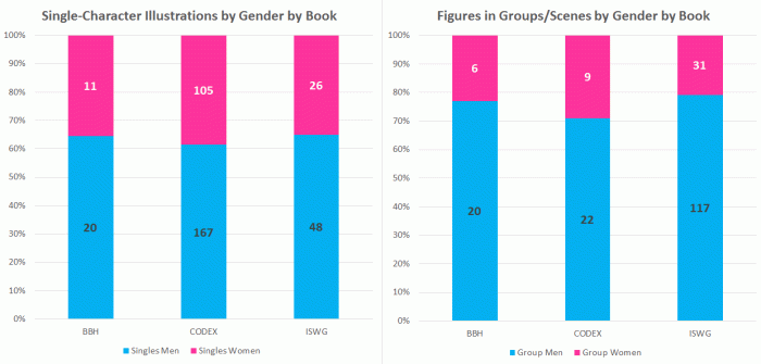
One thing that I also noticed while flipping through the books is that there seemed to be a marked difference in representation between group shots (shots with multiple figures) and shots with only one character; as such I looked at the gender-breakdown of single-character shots as well as group shots that contained male figures and group shots that contained female figures.

Gender Representation in Pathfinder Books: Depressingly Predictable

I went into this analysis hoping that the results wouldn’t be as predictably imbalanced as I thought they would be. And… well… the good news is that they weren’t. The bad news, however, is that’s only because they were worse than I had anticipated.
Gender

Out of the three books I surveyed, the NPC Codex wins the dubious distinction of being the most gender-balanced – despite actually having a higher percentage of male figures than Battle of Bloodmarch Hill – simply because all of the characters illustrated in the NPC Codex had handy text blurbs specifying who the character was. Conversely, the Inner Sea World Guide – the setting guide of all of the nations that make up Golarion (the official Pathfinder setting) – wins the “honors” of least gender-balanced, with an impressive 68% of all figures with discernible gender being male and only 24% being female.

Most depressing, however, is the fact that the breakdown for Battle of Bloodmarch Hill and the Inner Sea World Guide look almost identical, despite being published four years apart. The Inner Sea World Guide was released in 2011, the NPC Codex in 2012, and the Battle of Bloodmarch Hill was released in 2015. One would hope that there would be at least some movement toward inclusion, along the line of what Wizards managed with the release of 5th Edition D&D, in those four years, but… not so much.

Somewhere else that Pathfinder comes up short in comparison to D&D is the issue of representation in group shots. In examining the art from D&D 5th Edition books last year, I discovered that women were better represented in group shots than they were in single-character illustrations. So given the overall abysmal numbers of female representation, I was curious to see if that would be the case with these Pathfinder books. They are, after all, a pretty similar product. But as it turns out, women are actually less represented in groups and scenes!

Group-Versus-Single

Despite the fact that only 26% of all female figures in Battle of Bloodmarch Hill are women, 35% of all single-character illustrations are female – which means that group scenes are punching way below their weight. And while the disparity isn’t quite as noticeable with the other books, the fact remains that groups and scenes are actually less representative than single-character illustrations. Seriously, check this shit out:

Groups-and-Women

For all that Battle of Bloodmarch Hill had pretty much the same disappointingly low levels of female representation as the Inner Sea World Guide, there was only 1 illustration out of 8 (12.5%) that didn’t include any women. The Inner Sea World Guide, however, which is supposed to be a book about setting and the world of Golarion, had a staggering 59% of all group shots containing only men. Which is some weird and creepy shit, right there, when you’re writing a book about an entire world. Seriously, where the fuck are all the women???

And when women DID appear in group shots or scenes, the odds were pretty damn high that they would be THE ONLY WOMAN in the image. Only ONE of the 7 group shots in Battle of Bloodmarch Hill contained more than one woman. And out of the depressingly small number of group shots that DO contain women in the Inner Sea World Guide, only 31% of those images contain more than one woman, which is just… fucking depressing.

Differences in Depiction: Active Posing and Suggestive Attire

The other set of numbers that I collected for the three books focused on how men and women were portrayed differently. In collecting these numbers, again I stuck with my usual methodology for counting 1) figures that are actively posed versus neutrally posed 2) figures that were suggestively attired and 3) figures that were fully covered. (If you want to read explanations of how I determine these things, my methodology and reasoning are all spelled out here.) When looking at each figure, I also determined what the class archetype of the figure was: warrior, rogue, mage, or no class depicted.

When looking at active poses versus neutral poses, the numbers come out a bit mixed:

Active-v-Neutral

For both Battle of Bloodmarch Hill and the Inner Sea World Guide, women are slightly more likely to be posed as neutral than active. In the NPC Codex, women are slightly less likely to be posed as neutral. However, a confounding variable that I didn’t know how to account for was that the NPC Codex contains almost exclusively single-character illustrations with no background whatsoever, and it is significantly harder to draw a character that looks active with those constraints.

When looking at suggestively attired figures and fully covered figures, things similarly come out a bit mixed:

Pathfinder-SA-FC

[This section has been updated and corrected]

There is pretty close to an even gender split of suggestively attired figures in Battle of Bloodmarch Hill are male, with a slightly higher percentage of male figures counting as suggesting – although this is entirely owing to the fact that Battle of Bloodmarch Hill is a scenario that involves A LOT of orcs – almost none of whom are wearing shirts. And as I’ve written about VERY recently, simply not wearing a shirt does NOT make an illustration sexy. However, the numbers are a lot more clear in the NPC Codex and Inner Sea World Guide. In both of these books, women were about twice as likely to be suggestively attired as their male counterparts.

As for fully covered figures, again the prevalence of orcs plays havoc with these numbers in Battle of Bloodmarch Hill. Even so, women come out only slightly more likely to be fully covered, and in the NPC Codex they are less likely to be full covered. Which means that as usual, women have the double-whammy of being both less likely to be fully covered and more likely to be suggestively attired – which is in keeping with the general trend toward sexualization of women in game art.

[/correction]

Finally, we come to depictions of class archetype, which I include simply because in fantasy and gaming artwork, it’s still an unfortunately common stereotype to see men depicted overwhelmingly as fighters and women overwhelmingly depicted as mages. And the numbers are… mostly frustrating:

Class

Interestingly, the NPC Codex manages to have a nearly even split of how men and women are depicted, with women actually being slightly less likely to be depicted as not having a class than men. Which is fascinating! Especially since it’s bookended (in terms of publication dates) by Battle of Bloodmarch Hill and the Inner Sea World Guide, which are both very unbalanced in their class depictions.

In Battle of Bloodmarch Hill, only TWO out of 34 male figures that fit into a class archetype are shown as anything other than a warrior or fighter! As compared to the women, who are 40% less likely to be fighters and are nearly 20% more likely to not fit any class archetype at all. And the split is even worse when looking at the Inner Sea World Guide! Only 34% of all women can be said to fit into a class archetype – which is ALL KINDS OF DEPRESSING when you consider how incredibly underrepresented women are in the Inner Sea World Guide as a whole. There are vast swathes of the book where there are no women at all, and when women DO show up, fucking TWO THIRDS OF THEM aren’t even heroes or adventurers. They’re fucking barmaids, peasants, princesses, and slaves – which is some creepy woman-erasing misogynistic bullshit.

Stay Tuned!

Because next time, I’m going to be looking at specific piece of art – because HOLY SHIT THEY ARE SO BAD WTF HOW ARE THEY SO BAD.

So because I don’t want to end on such a downer note, here’s a baby squirrel:

GenCon’s Featured Presenters are 52% female, and that’s a huge deal

[Before I start – full disclosure, I am one of the Industry Insider Featured Presenters for this year’s GenCon. So I’m sure that there are those who will say that me writing this post is self-serving arrogance and/or egomania, but whatever.]

The GenCon Industry Insider Featured Presenters for 2016 have been announced, and holy shit is this year’s lineup amazing! Seriously, take a look:

GenCon-2016-IIFP2
For some reason they let me be one too. Not sure what that’s about. [joking]
That’s right, folks. There are 13 female IIFPs and only 12 men. This means there are MORE WOMEN THAN MEN, and that is a HUGE FUCKING DEAL, because that is a HUGE amount of change in a really short period of time. To prove it, let’s look at the numbers:

That said, while gender parity has been achieved, there’s still some progress to be made on other fronts. While there is increased representation of LGBT people, the lineup is still pretty darn white. Even so, the current lineup is a lot less cishet and is less white than in years past, which is encouraging. To quote Jessica Price, an IIFP and developer at Paizo:

Does this magically fix all of tabletop gaming’s misogyny problems? No. But women being recognized as gaming authorities, our work being highlighted, our input being sought, and just our presence in equal numbers with men helps

And importantly, this lineup is much more reflective of the diversity of activity within the gaming industry as a whole. In years past, in order to get selected you pretty much had to be a cishet white dude working for a mainstream company on trad tabletop games. But this year’s lineup includes a wide swath of thought-leadership in the hobby, including tabletop publishers, LARP designers, event organizers, activists, critics, podcasters, academics, and community managers. Which is EXCITING! I can’t wait to see what sort of discussion comes out of this year’s panels!

Lastly, there’s one other reason to be excited about this lineup, and it’s a doozy.

GenCon: First Industry convention to achieve parity

GenCon is pretty much THE FIRST major gaming industry convention to achieve gender parity in it’s lineup of guests of honor / special guests / featured guests / featured presenters – from here on out referred to as the GoH lineup, just so I don’t have to keep typing all of that out. (Honestly it would make my life a lot easier if the industry could agree on a standard term, event organizers. Just sayin’.) Don’t believe me? Let me back that up with some numbers.

I went looking at the GoH lineup for every convention in the United States and Canada with attendance over 10,000 that included gaming (of any kind) as a primary or secondary focus. (Sourced using Wikipedia, here)

This means that conventions without a GoH program were excluded, such as BlizzCon, Minecon, and PAX. (Although to be fair, PAX might have a GoH program, but their website was terrible and I gave up looking after twenty minutes.) I also didn’t include Game Developers Conference, despite being one of the major industry conferences, because they have a list of speakers with hundreds of people, but not a list of GoH, and given that I’m in school right now I just don’t have time for that shit. Lastly, E3 was also not included because they have industry partners and sponsors, but no GoH.

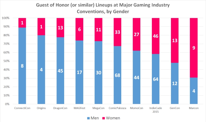
That left a list of 10 conventions. Most of them, finding a roster of 2016 GoH was easy, but for whatever reason I had trouble with IndieCade, so I counted their lineup for 2015, figuring that was a good enough approximation. And here’s what I came up with:

graph
CLICK FOR LARGER VIEW

Out of the ten conventions surveyed, only MarCon had more representation of women. However, while MarCon does include gaming as a secondary focus, it’s primarily a sci-fi and anime convention; it’s gaming presence is very small, and it’s not one of the major stops on the typical gaming industry convention tour. (I say this not to knock MarCon – it’s quite lovely, and I’ve been several times, before I left the US for Canada.)

So out of major gaming industry conventions? GenCon comes out clearly on top. The next-most even gender split of conventions that are more than just video games is Momo Con, which is still nearly two thirds male and has Totalbiscuit – one of the big names of GamerGate – as a GoH, for fuck’s sake.

Reactions to the lineup

There have been some encouragingly positive reactions to the announcement of the IIFP lineup. Both The Mary Sue and BoingBoing have highlighted the lineup and what it means for the industry.

But of course, there have also been those who are… less pleased with this development. Both Jessica Price and Whitney “Strix” Beltran (who was an IIFP last year, but not this year) have faced sexist backlash about the composition of the IIFP lineup – despite the fact that one of them is not a current IIFP and neither of them have anything to do with the selection process. Some of the “arguments” being presented are:

  • Old school RPGs are the only “real” RPGs
  • Mainstream trad games outsell indie games, and thus indie developers don’t matter
  • Indies chosen as IIFPs were selected because of pretentious identity politics and not merit
  • The current lineup is a result of “SJW gatekeepers”

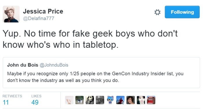
Thankfully, the amount of obviously sexist MRA garbage has been fairly small as of yet. However, there are those who have reacted by expressing puzzlement about why GenCon would select such an “obscure” lineup, or by speculating that only “unknowns” must be applying to the IIFP program.

Which. Ugh. There’s not as much gross sexism in that sort of response, but it’s still pretty insulting hearing people imply that the obvious increase in diversity must be as a result of an overall decrease of merit. And I could write a couple thousand words on that alone, but I think I’ll let Elizabeth Sampat and Jessica Price take it from here:

ESampat

JPrice
This isn’t actually a reply to Elizabeth’s tweet, it just amused me to place them this way

Mic. Dropped.

Pathfinder Adventures app: Okay gameplay and terrible art

[Before I start: I know there’s been a large gap between posts. This started as a 1-off post and spiraled into something that will be a series of 2 or 3 posts, since I got a bit carried away doing research and gathering material for this. I’m going to do my best to get another post up before the end of the week, if not two more. Thanks for your patience.]

I follow a lot of folks who enjoy Pathfinder, so when the new digital/app version of their Pathfinder card game – Pathfinder Adventure – launched, my feed saw several re-posts of announcements of the launch. I usually don’t tend to hop on the bandwagon of new games quite so quickly (remember how it took me six months after the last chapter of Life is Strange was released to actually finish it?), but it just so happens that I was bored with my latest mobile game of choice and was looking for something new to play.

So I decided that I would check it out to see what it was like; I had vague thoughts that maybe when I’d played enough of it to get a feel for the basics I could write a post comparing it to Hearthstone, since that’s a digital card game whose art I have written about hating WITH A PASSION.

[Sidebar: concerning the buggy UI]

Despite the fact that this is not a review, but rather an examination of artwork used, I would be remiss if I did not mention the many issues that I had trying to play this game. The gameplay itself was solidly designed, which shouldn’t be surprising as it was based on the pre-existing Pathfinder Adventure card game. However, the app would have been a lot more fun if it weren’t for the absolutely terrible UI.

Seriously, in addition to being completely opaque (I frequently found myself with absolutely no fucking clue of what I needed to do to advance to the next screen, with no tool-tip having been given), it was also horrifically buggy. The Pathfinder Adventure app was designed for tablets, but I often had to touch something multiple times to get it to respond, and dragging things anywhere on the screen was even worse.

So if what I say about the terrible art doesn’t turn you off playing, and you’d be interested in playing a card-based adventuring game that is reasonably entertaining and can be played for free, definitely check it out. But wait another month or two until it’s been adequately patched, because only the fact that I wanted to write about it for my blog kept me motivated to keep suffering through all of the terrible UI issues.

[/Sidebar]

I went into this wanting to know how the Pathfinder Adventures app would compare to Hearthstone, and I have to say that the loading screen didn’t exactly fill me with a lot of hope:

Main screen

God dammit, Wayne Reynolds.

Amusingly, I was pretty sure that this piece of art was one that I had seen before; I remembered it as being on a banner, which I hate, that I’ve seen at the Reaper Miniatures booth at GenCon every year. But it turns out that that piece of art is completely different trainwreck by Wayne Reynolds (scroll down, it’s about halfway through the post) which shows the same two characters fighting a dragon, not goblins. But just like this piece of art, it still features huge amounts of sideboob and a basically naked ass on Seoni.

This is why we can’t have nice things.

Except, no. Wait. This loading screen is why we can’t have nice things:

Loading Screen

That’s right,  everything but a goblin and Seoni’s completely unrealistic sideboob has been cropped out, because really what could convey the essence of the Pathfinder Adventures app better than a goblin and a half-naked sorceress? And this is the same loading screen you have to look at every time something is loading. So if you’re going to play the game, I hope you like looking at the side of badly rendered tits, because you’re going to be looking at this a lot. (Especially with the game’s unpredictable and sometimes long loading times.)

And apparently, the developers felt the need to re-use the same piece of art a THIRD time as one of the locations during one of the scenarios – by which point I was getting heartily sick of this bullshit Wayne Reynolds pile of hot garbage:

Awful Seoni Wallpaper2

And the worst part is, this isn’t even the only piece of Seoni fanservice garbage that gets used as a location background in the course of the first two story adventures! Later in the second adventure, I encountered this piece of location art and promptly facepalmed:

Seoni awful wallpaper

What the actual fuck? Why does EVERY GODDAMN PICTURE of Seoni need to contain sideboob? And what the hell is she doing with her staff? Is she fighting the monster or pole-dancing at it? How am I supposed to take this game at all seriously?

And unfortunately, it’s not just the location artwork that features frustratingly awful cheesecake fanservice. One of the early scenarios in story mode featured a main villain that looked like this:

Erylium

WHY. WHY DO FANTASY ARTISTS INSIST ON PUTTING BREASTS ON REPTILES?? If you have a character that is a bipedal reptile, to the point that they have scales and non-mammalian features like wings, horns, and crests, DON’T FUCKING GIVE THEM BREASTS. JUST. DON’T. Hell, there is an entire world of animals to choose from where I would accept more than two breasts as anatomically valid. Cats, for example. Cat-women could have anywhere between four and eight breasts, and while I would question your taste for feeling like you needed to illustrate something with eight breasts, at least you wouldn’t be abusing the limits of good sense.

And of course, it should go without saying that the contrast between the female villains and henchfolk is… well… stark:

Scenario henchmen

I don’t think I saw a single piece of card or location art in the first two story adventures that showed a man that was anything less than completely covered, and yet the women all came in varying flavors of cleavage, sideboob, underboob, and combinations of all three. What the fuck am I supposed to make of Lyrie’s outfit? Is double-sided garment tape just a standard part of every female adventurer’s kit in the Pathfinder universe? Does double-sided garment tape come imbued with significant bonuses to armor class? Or maybe with auto charges of cure spells or resurrection? Because I can’t think of a single reason why anyone would wear that outfit to do anything other than be in porn, and even then the setup required for that outfit looks like it would be way more trouble than it’s worth.

And because the artists want to make sure there are enough awful outfits and badly-rendered breasts to go around, there are lots of spell cards with cringe-tastic artwork too! Like these examples here:

Spell Cards

Unless the mage on the Guidance card is using dangerously sticky double-sided tape, there’s no way that that top wouldn’t just pop right off both of her breasts, and I don’t know about you but I don’t exactly relish the thought of charging into battle in the middle of a snowy plain with my tits just flapping in the wind. By a similar token, the outfit depicted on Inflict isn’t quite as bad, but that gigantic furry cloak is definitely at odds with the completely bared midriff. Wouldn’t it just be easier to put on a shirt that covered your whole torso instead of vastly overcompensating for not being adequately clothed? Lastly, while Force Missile deserves an honorable mention for being irritatingly deprotagonizing. If Pathfinder Adventures is about badass adventurers fighting monsters and being awesome, why does the art on this card look like she should be hopping up on a chair and yelling for someone to please squish the awful monster for her?

And sometimes, the villain card, the location card, and the story portrait come together to form one incredible hot mess of WTF-ness, as with Nualia – the supposed big-bad of an entire adventure:

Nualia

I’m sorry, but, what? I mean, boobplate is one thing, but what the hell is this? Her armor has individual boob-pods while leaving all of her stomach uncovered? And what the hell is with the skeletal hands as shoulder armor? And the bafflingly square gorget that protects her neck from all angles while, again, LEAVING ALL OF HER VITAL ORGANS EXPOSED? What the crapping crap??

So is Pathfinder Adventures as awful in its artwork as Hearthstone? It’s hard for me to compare, given that I played only six or so hours of Pathfinder Adventures, as opposed to a few hundred of Hearthstone. My impression is that overall it seems to do better, but given the baseline level of awful that Blizzard habitually occupies, saying Pathfinder Adventures isn’t “as bad” as something made by Blizzard is damning it with faint praise.

[Next time: How does the Pathfinder app compare to art in Pathfinder books?]